Beer for Mischief — Off Color Brewing in Chicago, Illinois
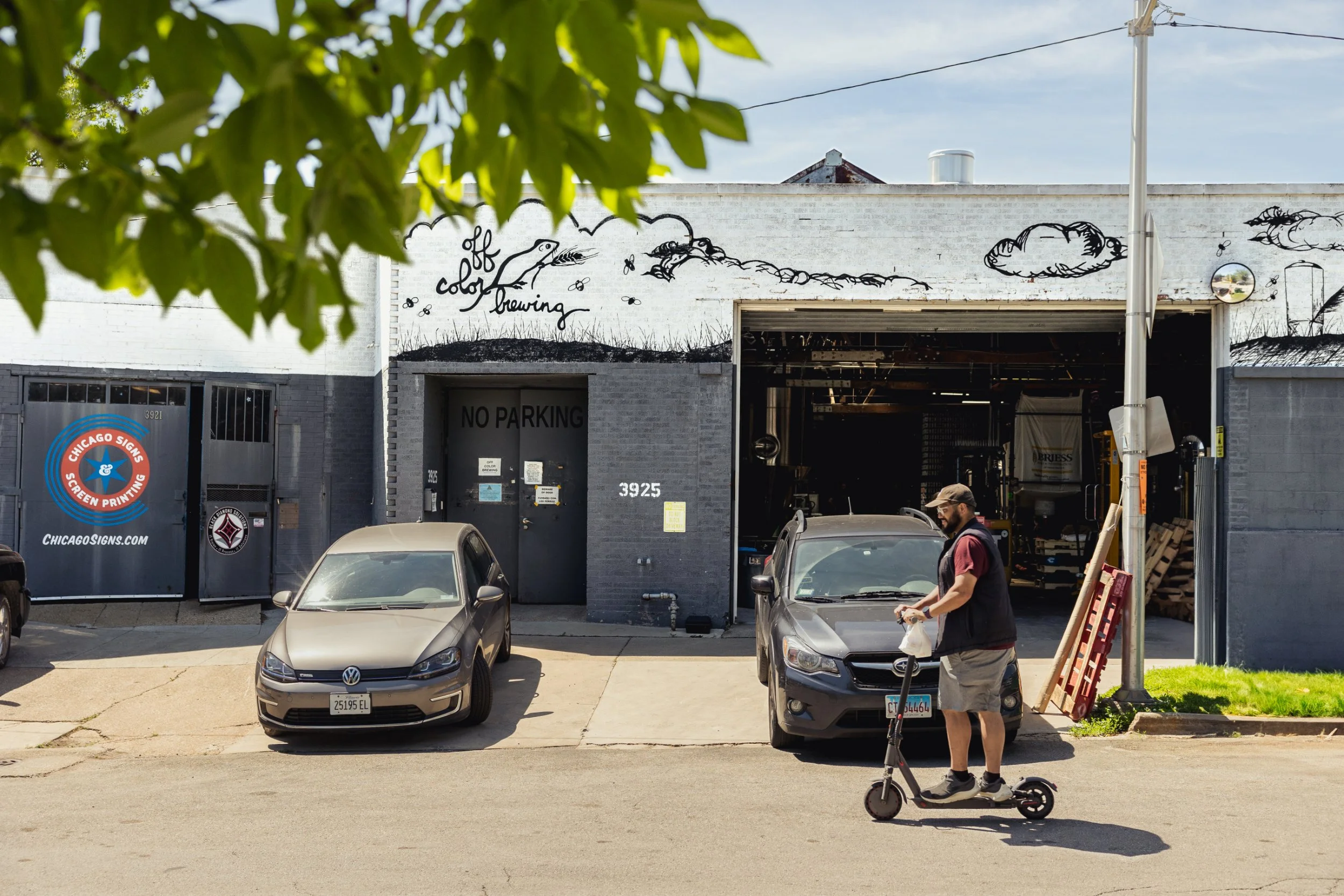
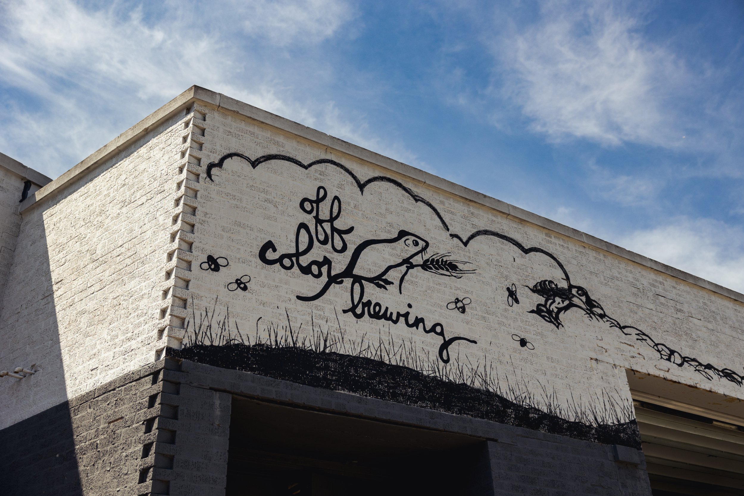
A group of mice is known as a mischief. This fact strikes me as appropriate as I stare at the line-drawn mouse on a can of Off Color Brewing’s Beer for Lounging. The mouse is one in a menagerie of characters that decorate the Chicago, Illinois–based brewery’s labels, including a capybara, a lion, and a number of cats. All of them are playfully engaged in a variety of anthropomorphic activities. They’re deceptively simple drawings—the kind of art you could imagine doodling on a bartop napkin—but are really the expression of a great deal of time and talent.
These characters are fitting avatars for a brewery that has spent the past 13 years making very intentional and intricate actions look effortless and casual. It has carefully cultivated an image of whimsy and delight, which reminds us that craft beer should be fun—but that doesn’t mean it should be easy.
The strategic simplicity of its artwork, the controlled chaos of its beer portfolio, and the hardworking nonchalance of its brand have all helped Off Color carve out a niche in a competitive local and national beer scene, without ever looking like it’s trying too hard or running out of ideas.
The brewery remains as mischievous as its diminutive mascot, and just as resourceful.
Photography by Steph Byce
***
John Laffler was working with youth in a substance-abuse therapy program in the mid 2000s, and had reached the limit of what he could do with his licensure.
He was at a crossroads: pursue further education or find a different career. While he was visiting a graduate program in Portland, Oregon, his girlfriend at the time observed that she’d only really seen him excited when exploring the city’s breweries. After they got back to Chicago, he enrolled at the Siebel Institute of Technology to learn the brewing trade, and while he was there, met fellow student Dave Bleitner. The two became fast friends.
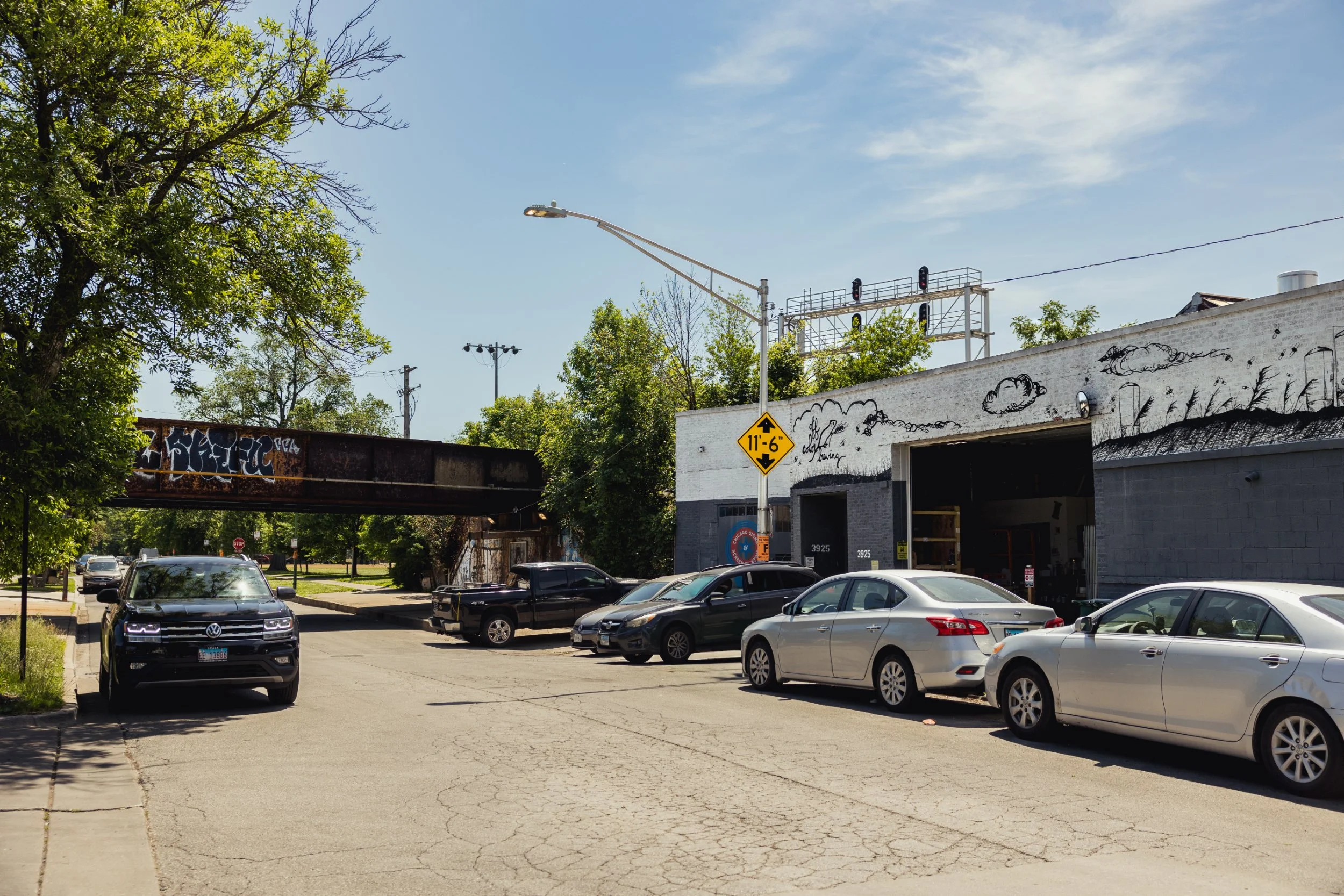
The pair emerged from the course in 2008 into a city with few available brewing positions, however. Metropolitan Brewing had just opened, and they approached founders Doug and Tracy Hurst about helping out.
“We were like, ‘Hey, we’re available. Do you guys need help?’” John recalls. “And they’re like, ‘Yeah, but we have no money. We’ll buy you lunch.’”
The two interned at Metropolitan, occasionally getting to brew their own concepts on the pilot system. From there, John moved on to industry pioneers Goose Island Beer Co., and Dave to Two Brothers Brewing Company west of the city. After several years spent doing everything from mopping floors to brewing beer, they were ready to set out on their own. Rather than seeing this menial work as merely paying dues, John viewed it as invaluable experience.
“In a restaurant, you start washing dishes and then you hopefully start making salad and you work your way up from each station to each station, learning everything along the way and having that really strong and wide basis of knowledge,” he says. “It’s not hard to make wort. What’s really hard is to figure out what to do when things go wrong, what to prioritise, where you can cut some corners, and where you absolutely have to make sure everything’s done to a T.”
Off Color opened in 2013 with two beers: Troublesome—a classic, unfruited gose—and Scurry, a kottbusser. Launching with two obscure German styles was less a statement of defiance than an indication of intent: They were going to brew delicious, approachable beer, but it wasn’t going to be everyone else’s delicious, approachable beer.
***
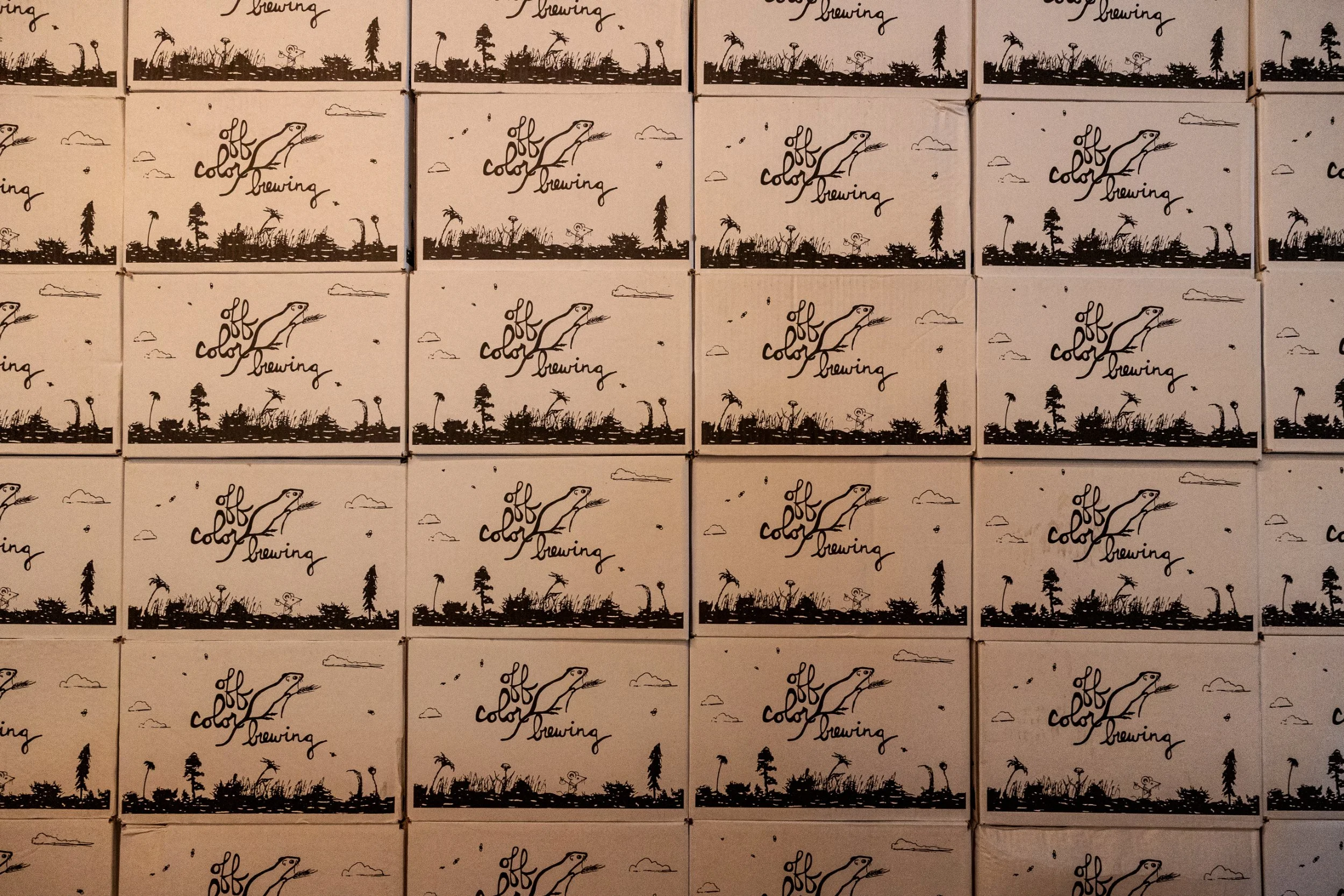
As unorthodox as Off Color’s beer was, it was matched by the quirky, black-and-white label art. Craft beer branding at the time was rarely subtle, and John and Dave opted for contrast from the prismatic norm rather than competing with a cornucopia of colorful labels.
“We ended up on black-and-white just because it really stands out on liquor store shelves,” John says. “You go into the beer section and there’s all this color vomit everywhere, where everyone’s just trying to outcompete each other by having a brighter, more garish color palette.”
““Coming up through beer, the rallying cry was ‘a rising tide lifts all ships.’ It’s like, well, you’re now in a giant sea of mediocrity amongst a whole bunch of other ships.””
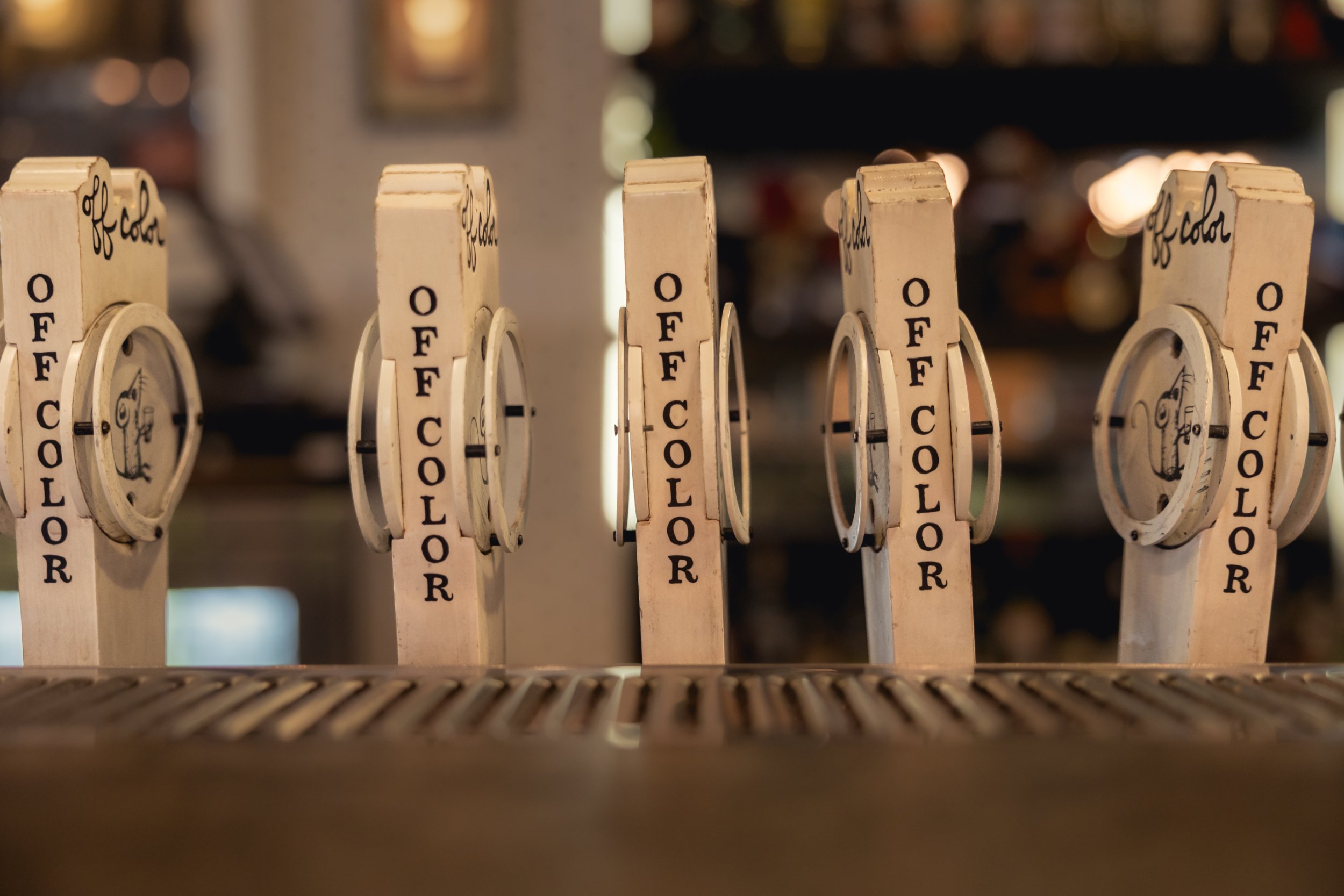
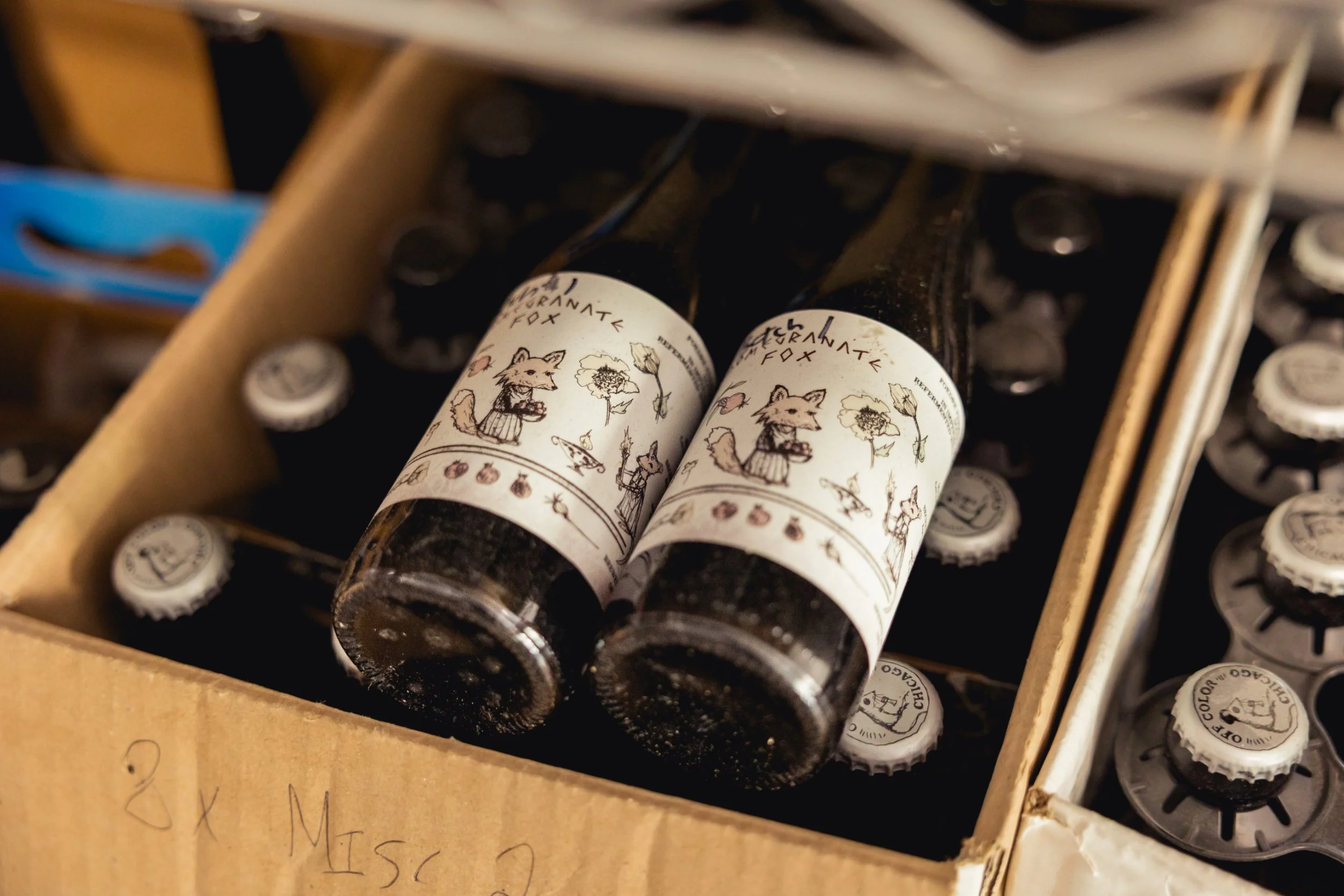
They wanted something more akin to the refined elegance of wine labels, but with a nod to the lighthearted spirit of craft beer. John’s mother was a children’s librarian when he was growing up, and he has long had a soft spot for children’s book illustrations. He reached out to illustrator and schoolteacher Nikki Jarecki to create the character-driven drawings that have come to define Off Color’s labels, a style marketing manager Ben Ustick (LinkedIn lists his job title as “Cat Outreach”) describes as “Shel Silverstein as inspired by Roald Dahl.”
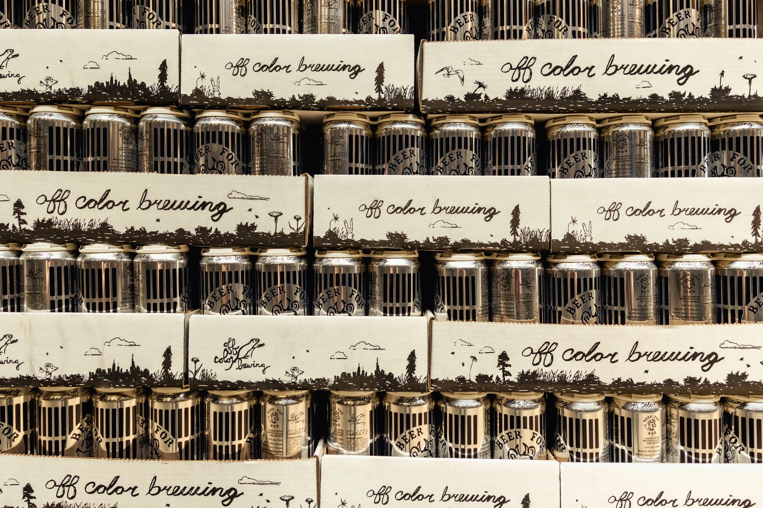
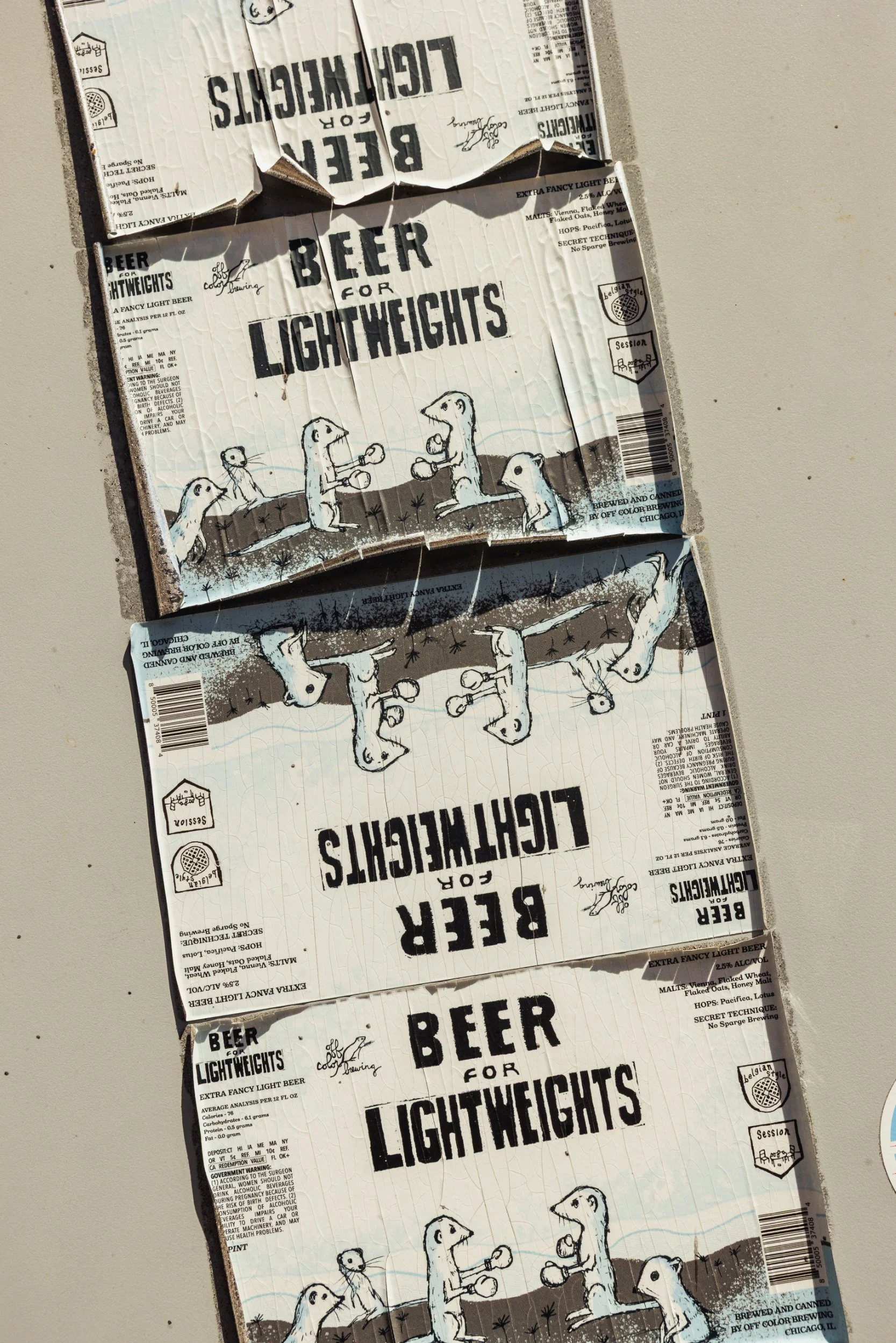
“The direction I got was, ‘Can we make something the opposite of Three Floyds?’” Nikki recalls. Three Floyds, just over the border in Indiana, was still getting a lot of hype in the early 2010s, and its labels were adorned with ornate, heavy metal-inspired graphics. Off Color’s founders had no hate for the brewery, but also saw no reason to try to compete. Rather than a Dark Lord, John and Dave opted for a diminutive grain mouse, the only creature who was in the brewery more often than they were.
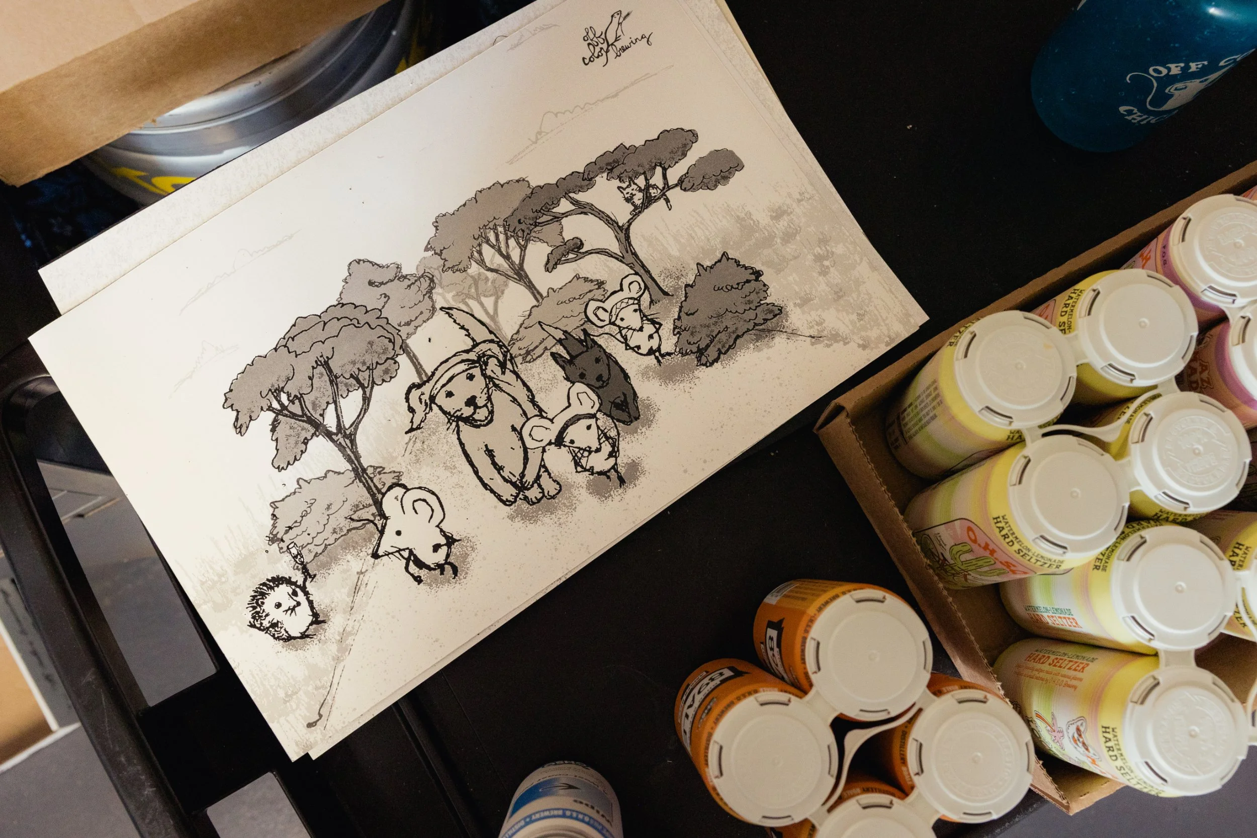
“It took me a minute to find the voice of the brand at first when I was making the mouse logo, because I went to art school and I really liked nature, so I was drawing things super detailed,” Nikki says. “Then they told me to just make it simpler. And then I was like, okay, we’ll just make it sketchy and kind of children’s-book-illustration-style, with thick outlines, some shading with cross-hatching, and watercolour washes.”
Nikki has since drawn the illustrations for well over 100 Off Color labels. The process of creating a finished label design is far more complicated than you might guess. After the brew team lets Nikki know their ideas for a new label, she draws dozens of variations of the characters based on the prompt. Then it’s up to Off Color’s graphic designers, led by Tim Breen, to assemble them into a finished scene and format it for the label.
“One thing I love about the way Nikki works is she won’t draw three mice; she’ll draw 30 mice, each with minor differences, because she’s a consummate professional,” John says. Many of the brewery’s labels include Easter eggs Nikki has added in, such as employees’ pets or details from her apartment.
By not trying to be louder than its neighbours on store shelves, Off Color has earned brand recognition through whispers rather than shouts. Even a casual consumer is likely to recognise the brewery’s style when they see it again.
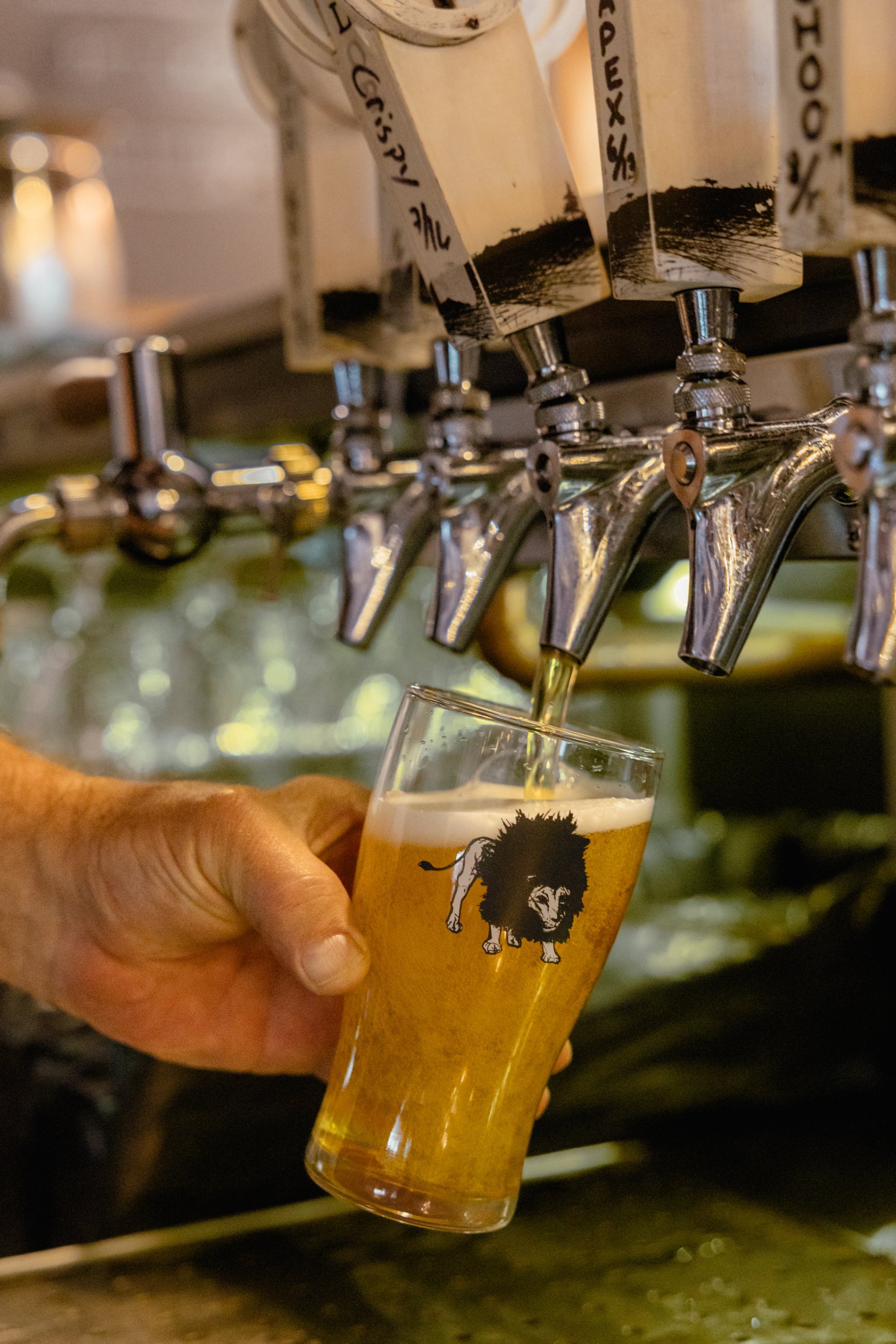
“It’s absolutely helpful to me [as a beer seller],” says Chris Quinn, proprietor of popular Chicago beer bar and bottle shop The Beer Temple. “When a customer is walking toward a wall of beer and it’s just a splatter of colours, Off Color’s specific style stands out so much. I always think it’s the highest compliment in branding when I personally can’t separate the branding from the beer, even as I’m drinking it. If I’m thinking about Apex Predator the beer, I’m thinking about the artwork. I can’t think of a brewery that’s more the case for than Off Color.”
***
As with its design philosophy, Off Color has opted not to compete against what most other breweries are doing on the brewing side, either. IPA was and still is the locomotive of the craft beer train, but more than a dozen years in, Off Color still hasn’t climbed aboard. This wasn’t down to stubborn rebellion, but rather a conscious decision to find the customers who want what they’re selling.
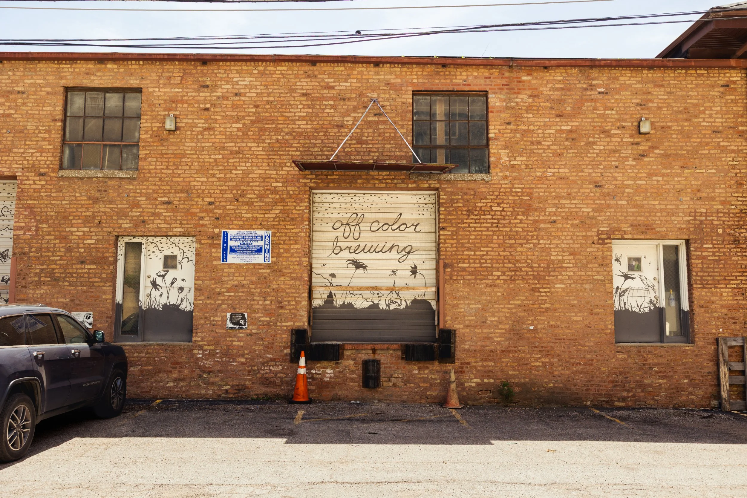
“For 95% of the breweries in the United States, their flagship beer is an IPA,” John says. “Why do we want to compete for that same shelf space, for that same consumer, against everybody else when we can just focus on the 5% of folks who are looking for something different? We make some really weird beers for people who like really weird beers, but we don’t try to sell those to everybody. [We’re] doing the legwork of being inviting, being welcoming, and making beers that are approachable, unique, and engaging, but also have a purpose and a reason to be there.”
““I always think it’s the highest compliment in branding when I personally can’t separate the branding from the beer, even as I’m drinking it.””
Early on, Off Color focused on brewing wild ales and other esoteric styles, and it has continued to stay devoted to these beers, even as its volume has shifted toward more recognisable styles.
“We make mixed-ferm beers because I love mixed-ferm beers,” John says. “There’s not a lot of people doing them well in the United States. And for a while, there were a lot of people trying to do them poorly, and massively overpricing them. Coming up through beer, the rallying cry was ‘a rising tide lifts all ships.’ It’s like, well, you’re now in a giant sea of mediocrity amongst a whole bunch of other ships.”
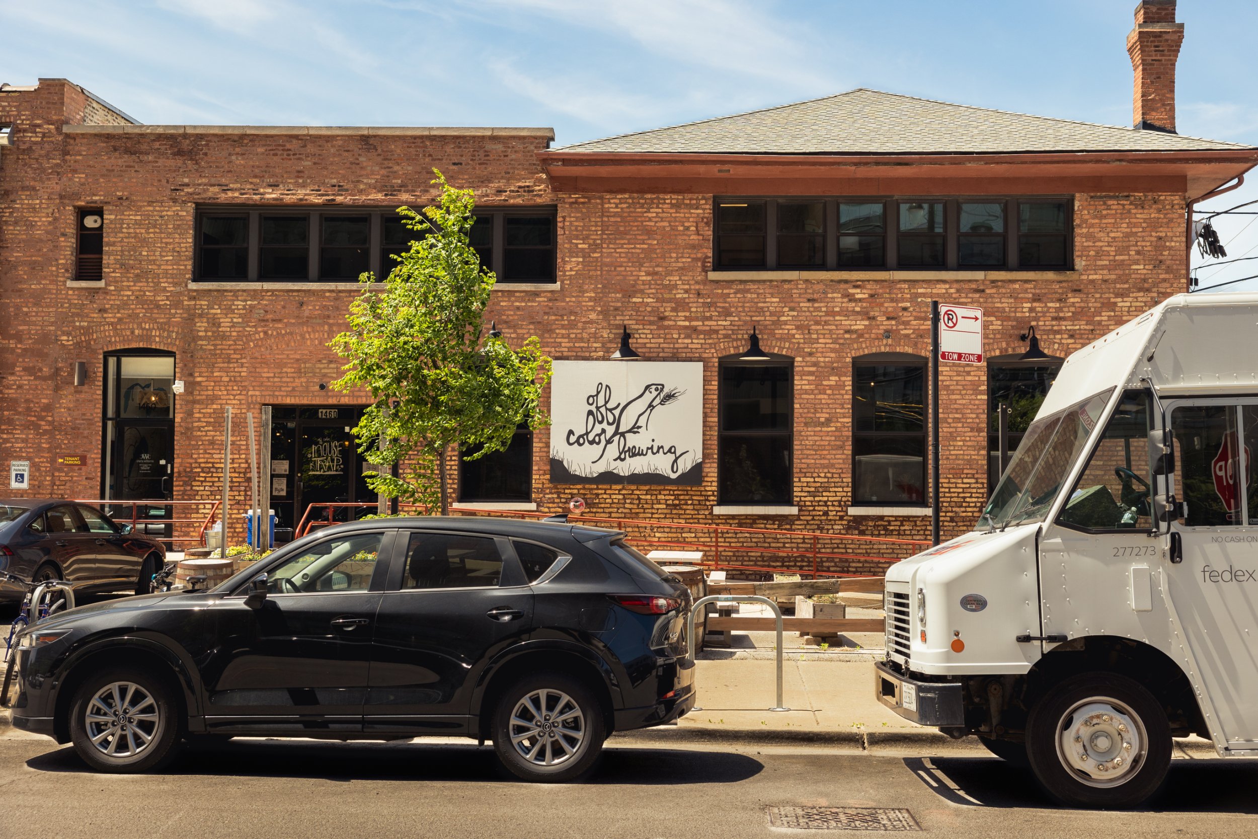
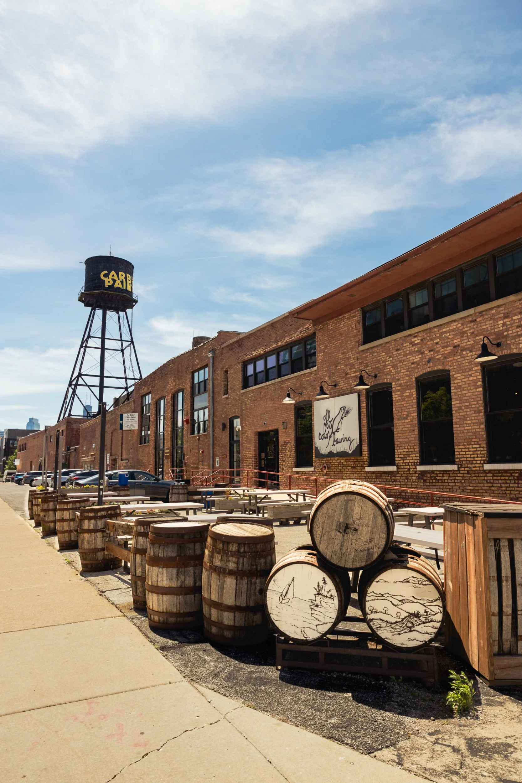
During the brewery boom of the early-to-mid 2000s, the assumption was that drinkers would multiply to meet these growing production volumes, but craft beer fandom proved to be a finite and fickle resource. You had to set yourself apart. For Off Color, that meant producing a boldly hopped Saison called Apex Predator. It was the brewery’s third year-round release, and then quickly became its flagship. Today, the beer is still a third of Off Color’s production by volume.
“There wasn’t anything like it at the time,” says Dave. “It had this juicy profile from yeast and dry-hopping, before juicy became the de facto word for any overhopped IPA. It hit the right notes before the market knew it was ready for that.”
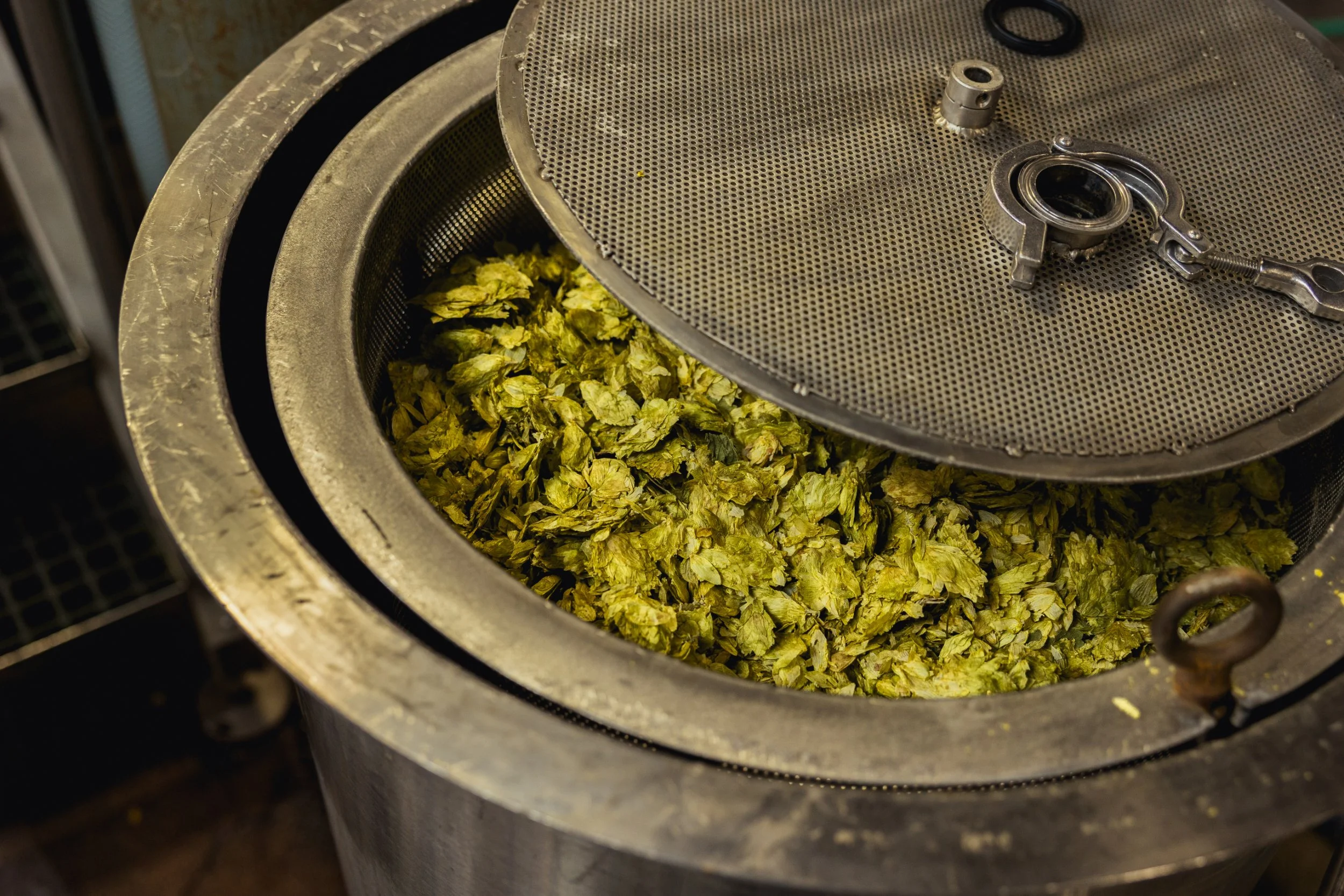
Apex Predator is dry-hopped with Crystal hops, and features a free-rise fermentation with a Belgian saison strain that produces bright pineapple notes. It’s a delightful marriage of fermentation and hop character, and it’s found an audience in a craft beer scene that normally overlooks the style.
“We’re the only ones,” Dave says of his flagship’s success. “I don’t know how we get away with it, and I don’t care.”
It took time for Dave and his brewers to get the beer’s fermentation dialed in and consistent. For a while, different batches were coming out with wide variations in ester production. Through sensory analysis, they honed in on the issues, and now stress out the yeast just a bit by under-oxygenating it. Over a 14-17-day fermentation, it now produces consistent results.
“We get a lot of people who come in and are basically like, ‘I’ll have your IPA because that’s the default craft beer. I don’t know what beers you make,’” says John. “And then you put an Apex in front of them and they’re like, ‘Oh, cool. What is this? This is different,’ but it’s still approachable. You want to lead people a little bit, but not too far.”
In 2025, John got a call from Cory King of the revered St. Louis brewery Side Project. He was heading up to Chicago and wanted to make sure John and Dave would be in town. When he showed up, he delivered a piece of American brewing lore: the barrel known as pH1.
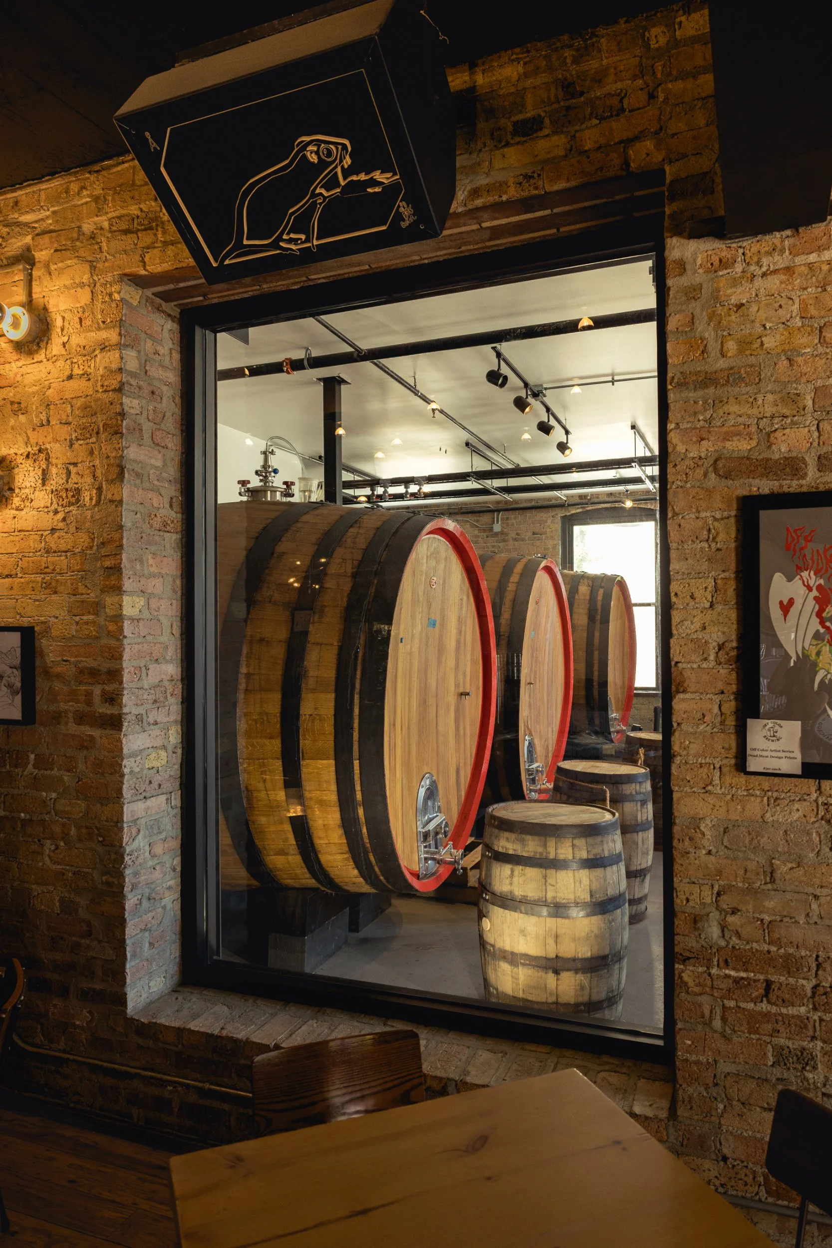
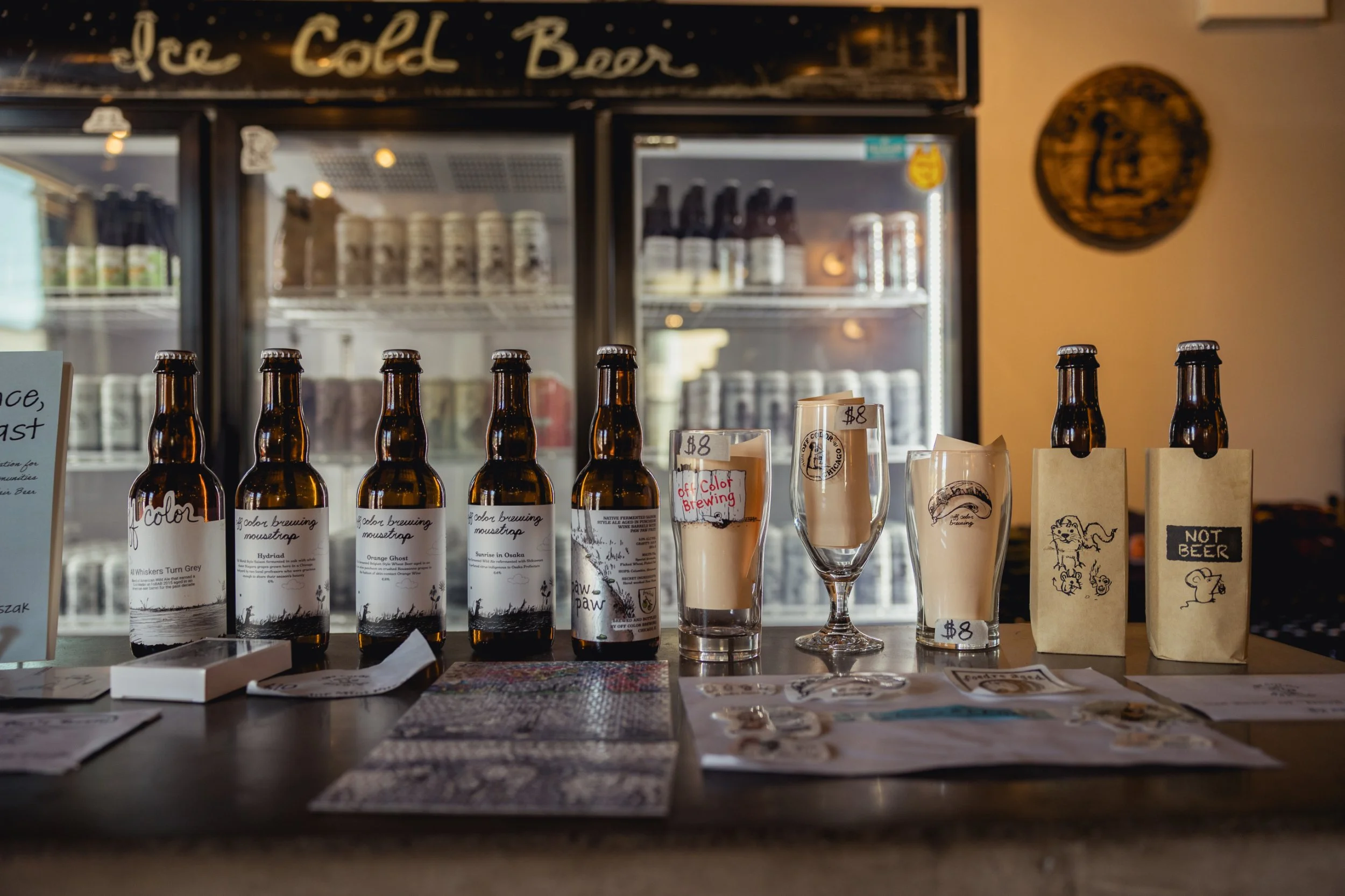
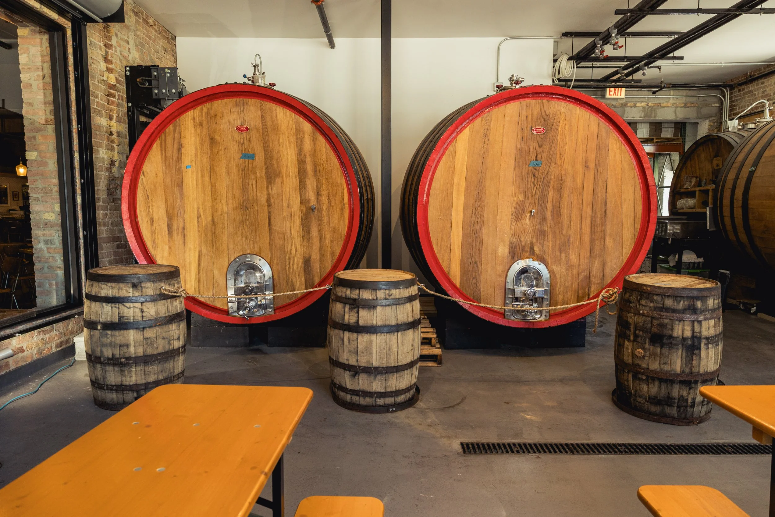
The barrel was originally used for producing La Folie, a foundational sour ale from Colorado’s New Belgium Brewing in the early 2000s. It had been purchased from a local winery by Peter Bouckaert, who had come over from Brouwerij Rodenbach in Belgium to help establish a sour beer program at New Belgium. He and his brewers noted the best batches were coming out of this barrel he had marked “pH1.”
The barrel was eventually sold to Russian River Brewing Company, and Peter stumbled upon it in the California brewery’s barrel room years later. Since then, it has passed among some of the country’s best mixed-fermentation brewers. Now, it sits at Off Color. John says the validation of his peers passing the barrel along to him is better than any World Beer Cup or Great American Beer Festival medal, and preserving legacies like this is part of why he loves oft-overlooked styles.
“I’ve always looked at the tiny saison producers in Belgium,” he says. “Those are where my heart is, and those are the beers I truly love and try to emulate and create here. They don’t sell particularly well, but that’s not why we make them. We make them because we think they’re important.”
***
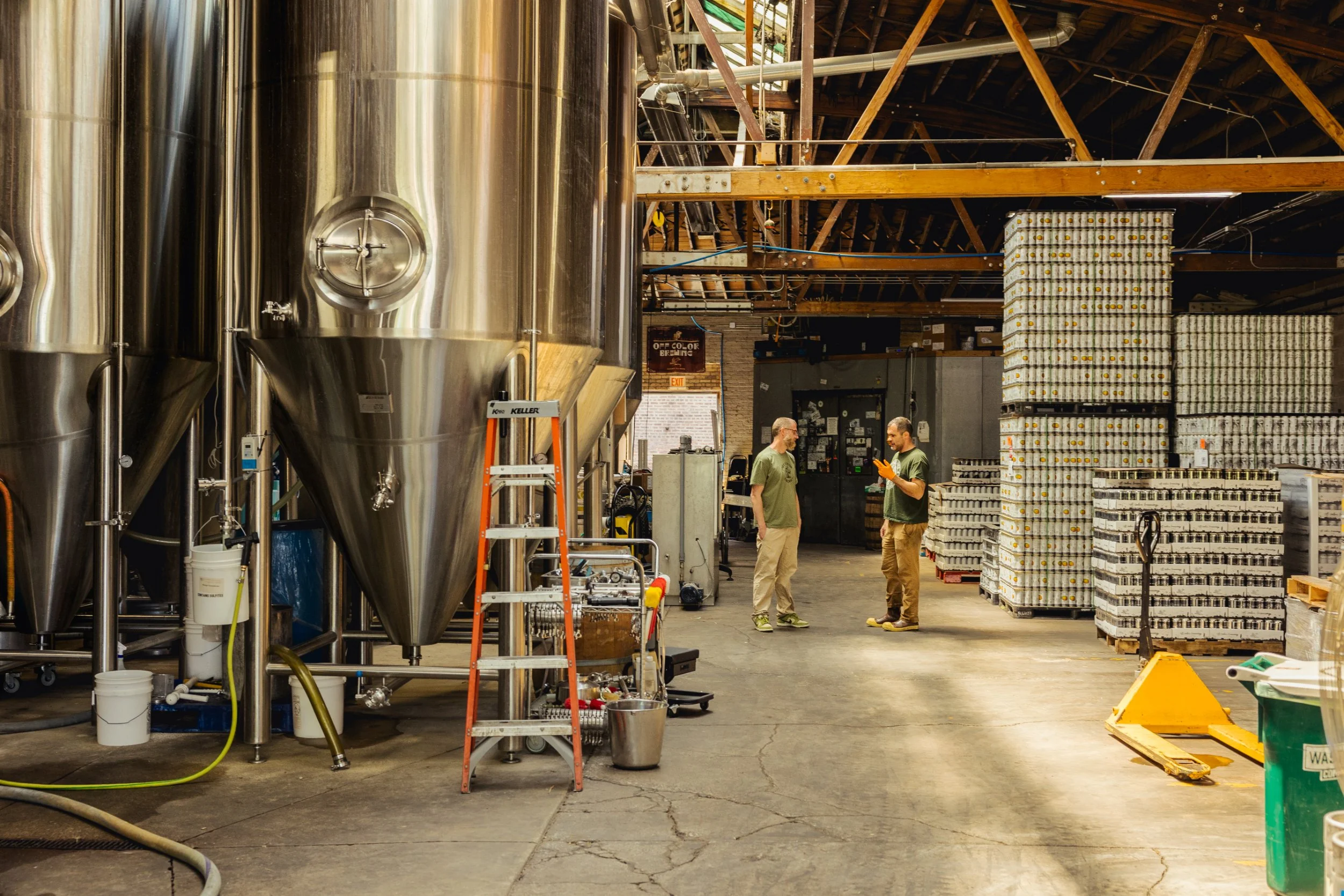
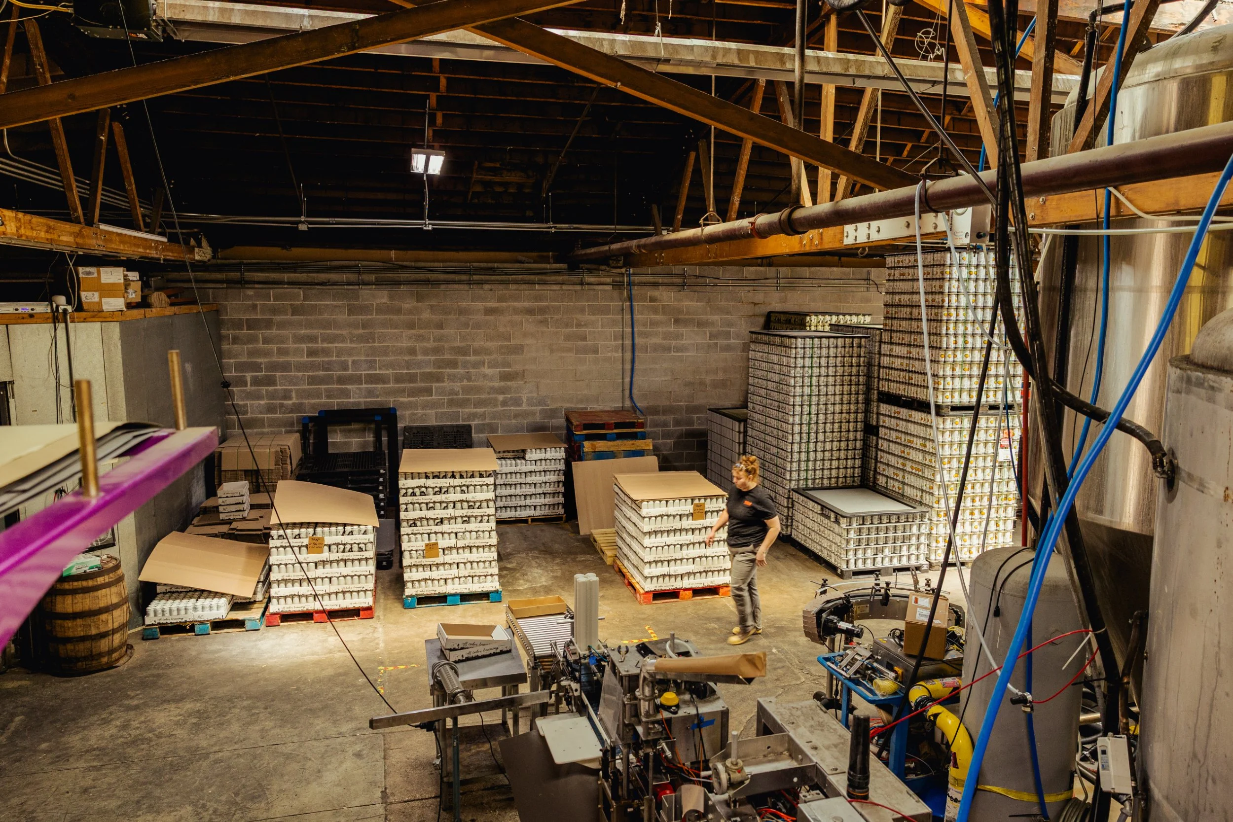
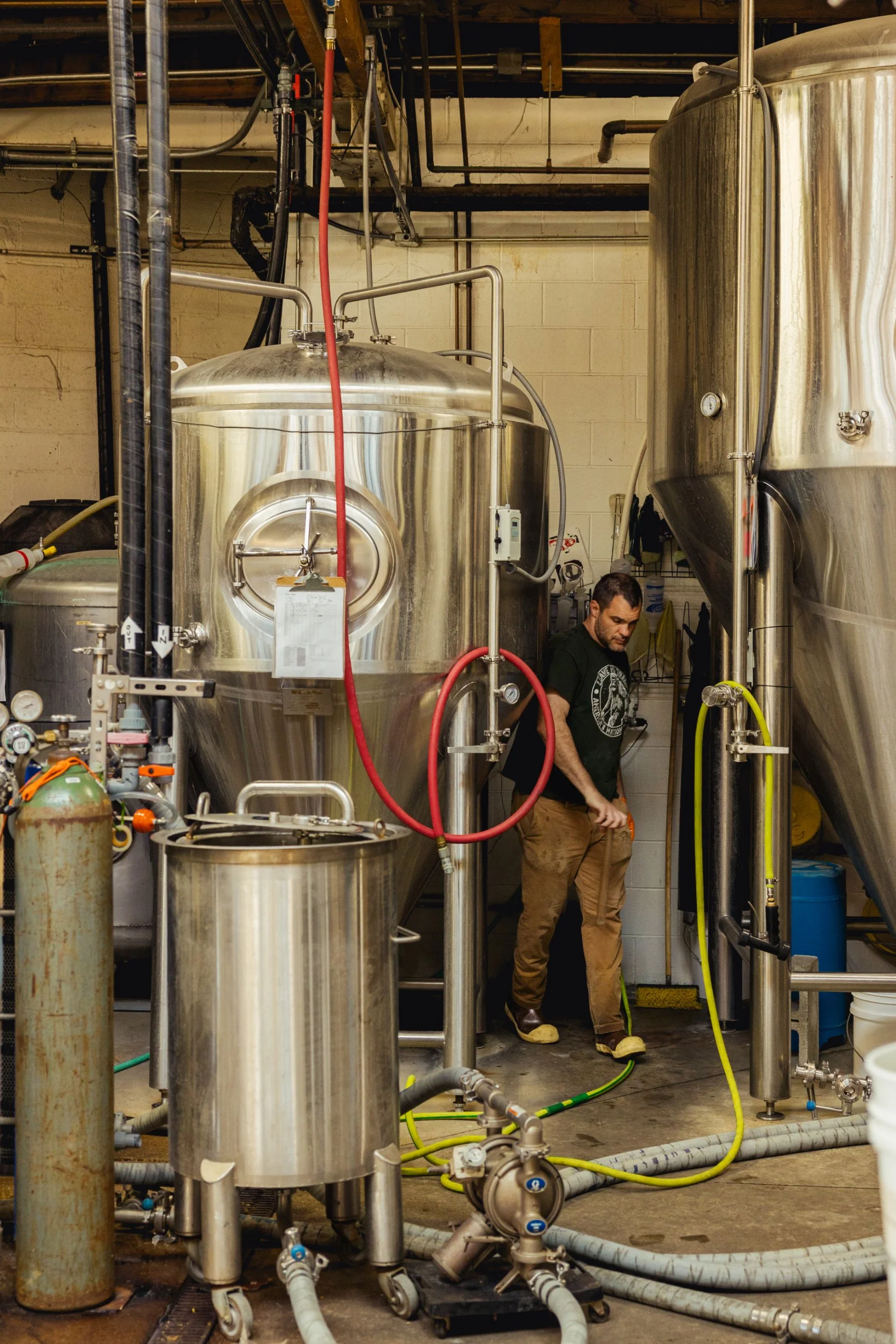
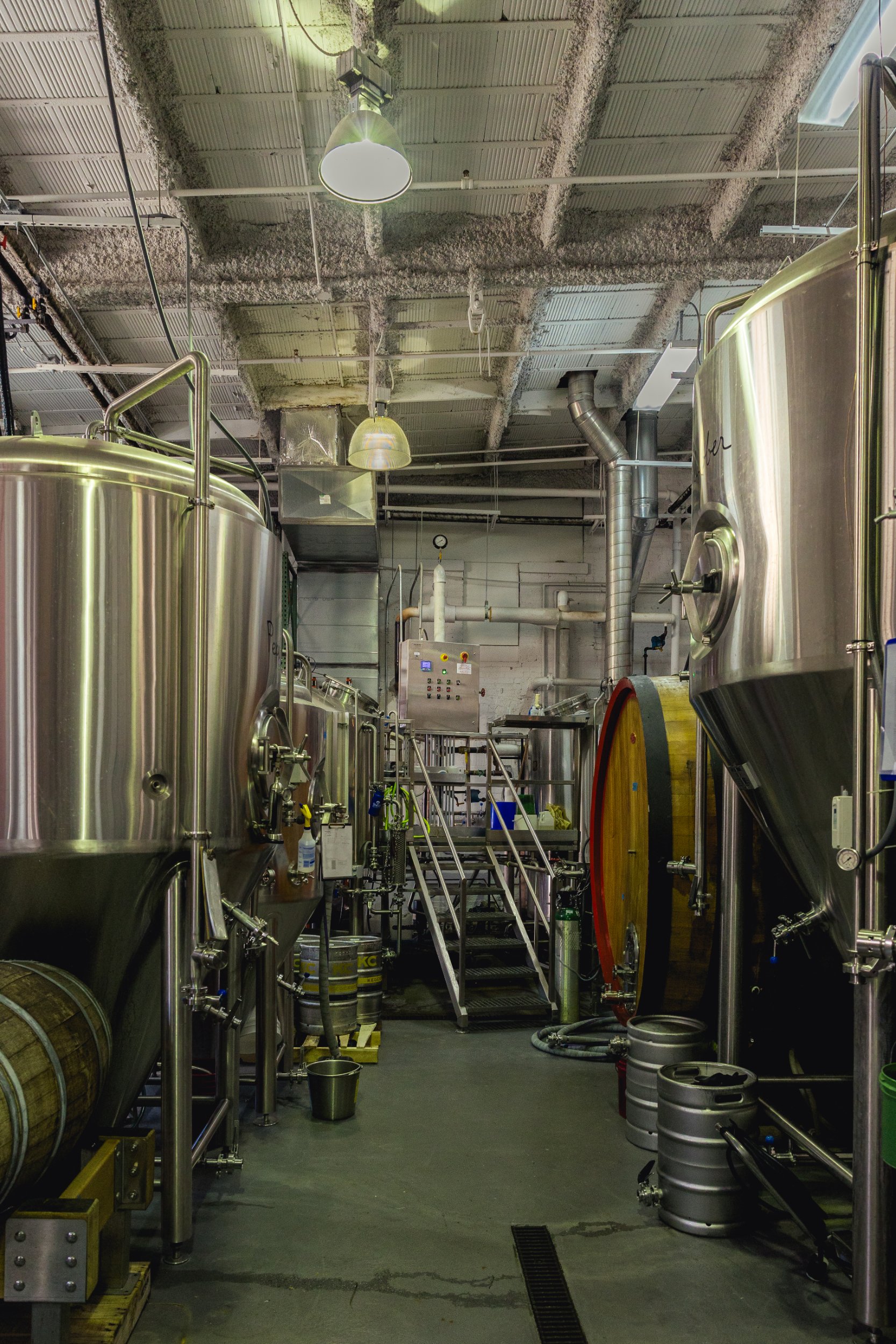
Despite its reputation for mixed- fermentation brewing, however, the majority of Off Color’s beers—like Apex Predator—are conventionally fermented in its production plant. Dave oversees a 2-vessel system with a 20bbl brewhouse and 60 bbl fermenters (the team generally brews triple batches to fill them). The brewery cranks out about 4,700 bbls annually, 85% of which is sold in distribution. Apex is the top-seller, followed very closely by Beer for Pizza, an Italian pils and the best-selling beer in the taproom.
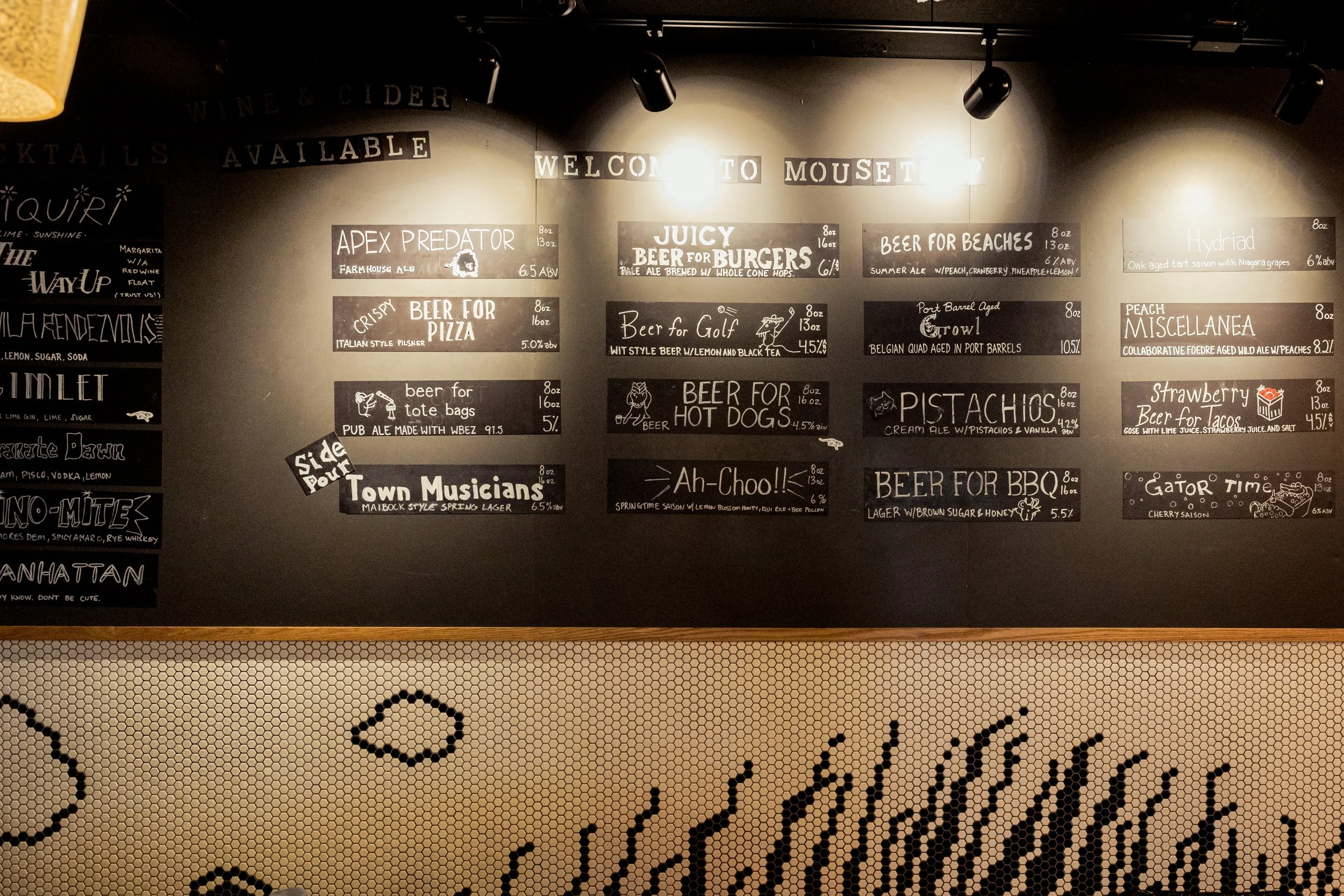
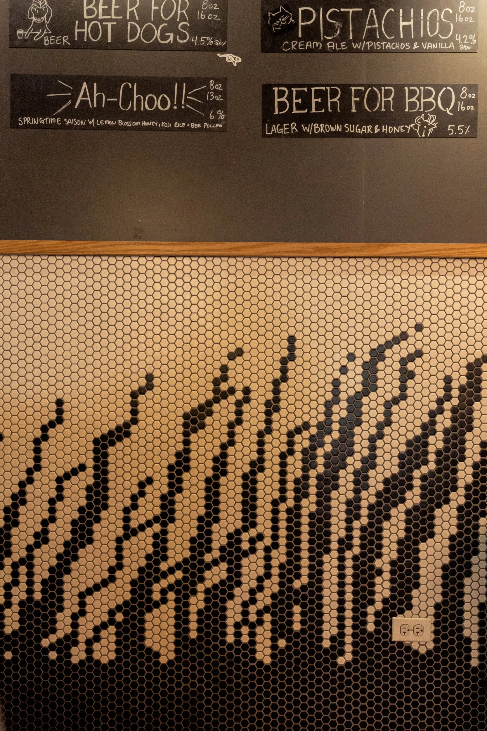
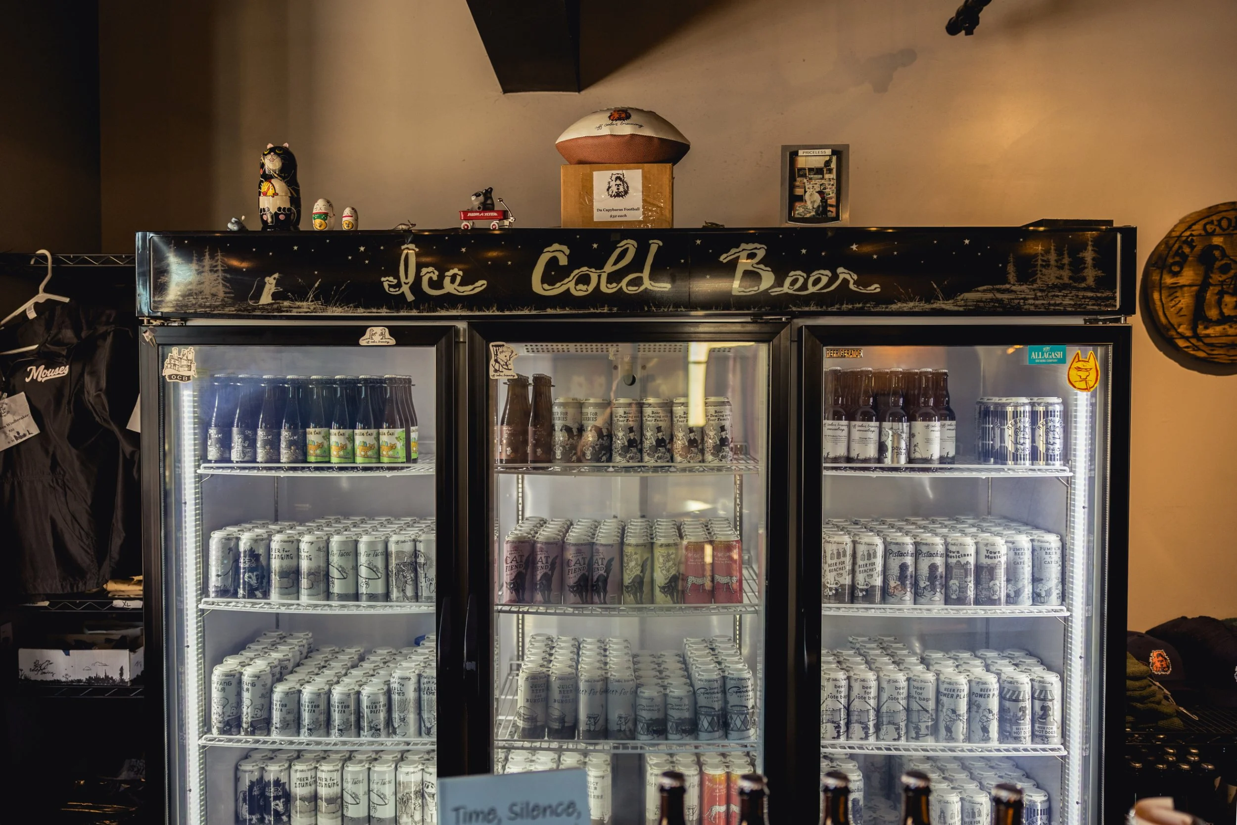
Increasingly, the brewery’s Beer For series has helped keep the lights on. The idea of “occasions” in beer marketing has gained a sometimes eye-rolling level of attention in recent years, but Off Color has organically elevated the concept to a tongue-in-cheek art form.
““Beer For has given us licence to do whatever we want, as long as I call it Beer For something,” ”
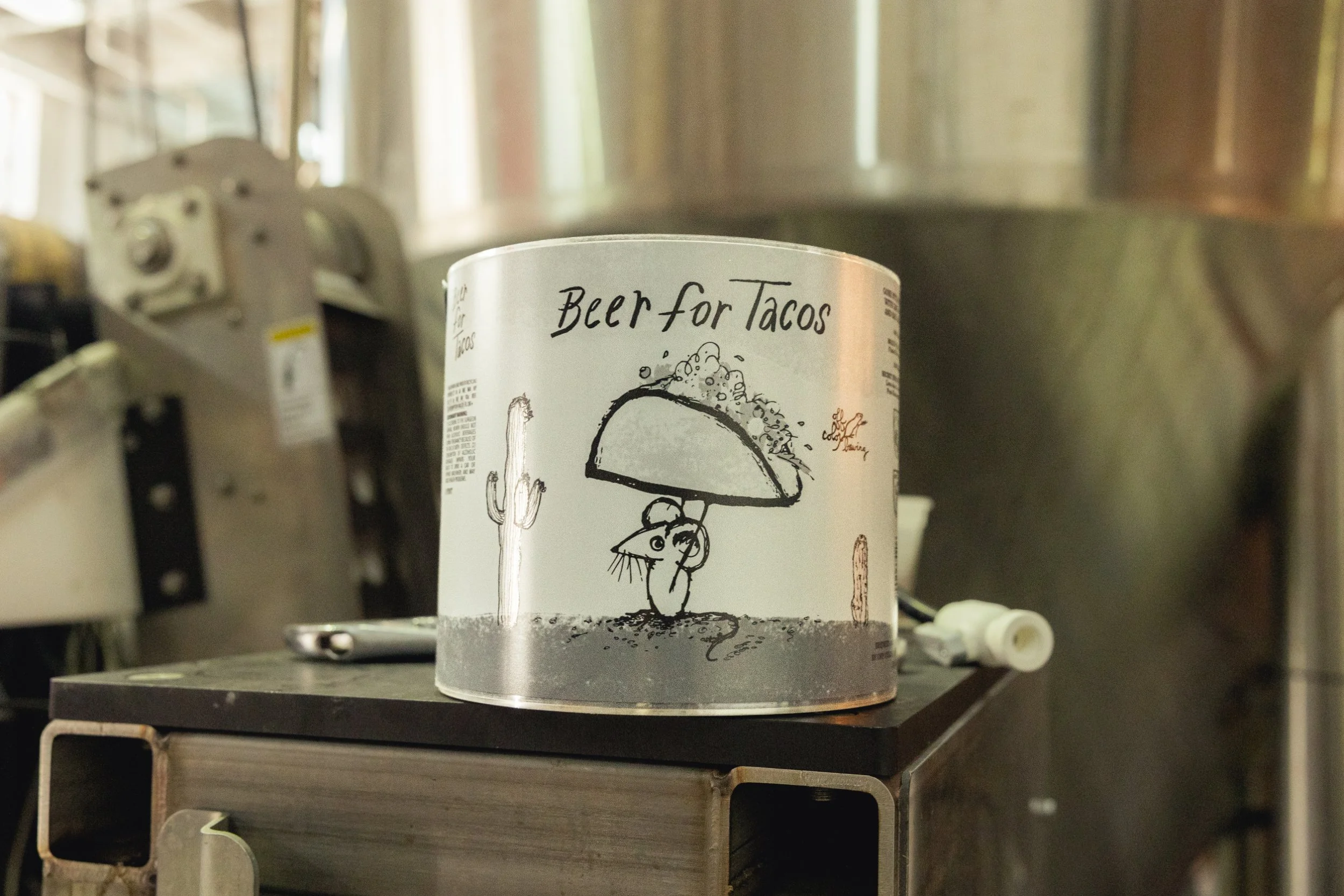
In 2018, the brewery was making a margarita-inspired gose for a local taco joint. The team needed a name for it, and John sarcastically said to just call it Beer for Tacos. They did, and the beer proved popular. Early in the Covid-19 pandemic, the brewers had beer sitting in tanks with nowhere to go, so they used it to make an Arnold Palmer-inspired witbier and called it Beer for Golf. They put it up for preorder for takeaway only, and the entire run of nearly 60 cases sold out quickly. From there, Beer For has taken on a life of its own.
“Beer For has given us licence to do whatever we want, as long as I call it Beer For something,” Dave says.
Many fans first encountered Off Color through this series. The brewery has been successful getting specific Beer For brands placed at relevant venues where the concept can essentially sell itself. For example, it’s notoriously hard for breweries to get beers into Chicago’s major sports stadiums. Within six weeks of Beer for Baseball being released, however, the Chicago White Sox reached out asking for it.
“I’ll go to a hockey game or go bowling or go get tacos, and in my industry brain I’ll think, ‘Well, that was an easy sell to get that placed here,’” says Chris Quinn. “The customer is thinking, ‘I’m having tacos, this beer is literally called that, let’s give it a try.’ Now they like it, and they pick it up whenever. I think it’s a great foot in the door.”
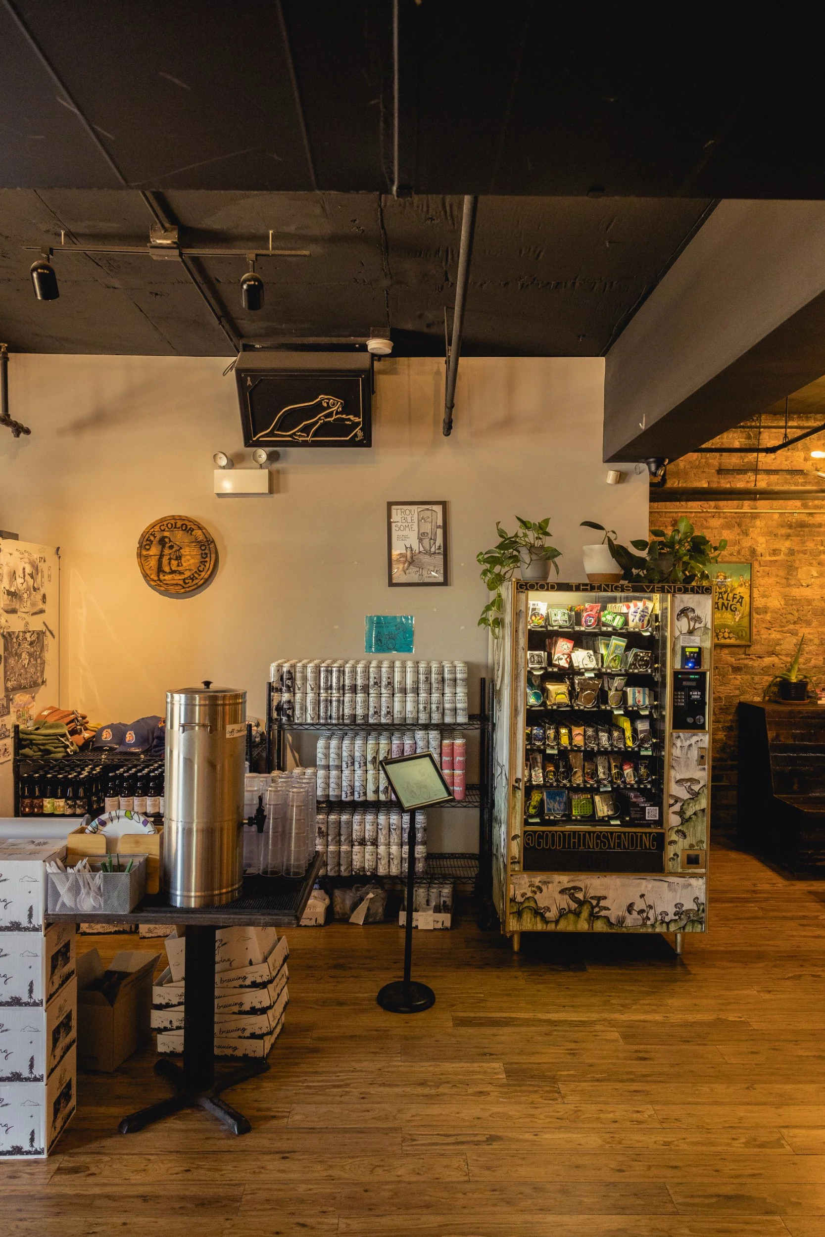
The Beer For series has also translated well to one of Off Color’s most surprising sources of revenue: branded merch. While nearly every brewery sells T-shirts, hats, and other common items emblazoned with its logo, Off Color has turned merch into its own branch of the business.
“It’s not like we’re just stamping a logo on a different shirt color,” says Ben. “The [designs] we do are very specific to the merch it’s on, and the art usually ties in, and there are a lot of layers of that.”
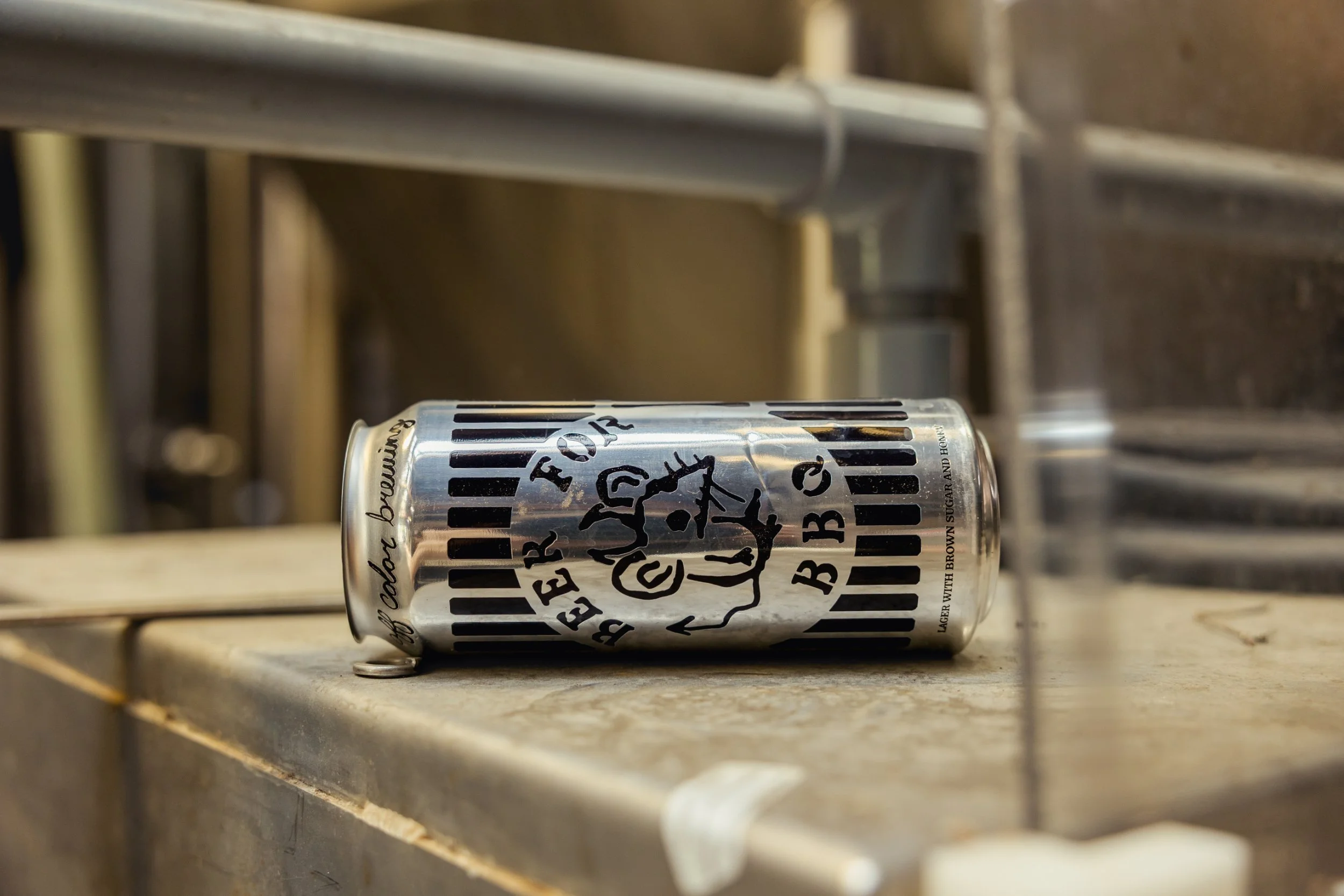
In January 2021, when the Omicron variant of Covid-19 had everyone staying home, Off Color decided to market sweatpants decorated with its adorable capybara, and branded them Beer for Lounging, named for an eponymous beer the brewery says is “the least-hoppy American pale ale ever.” It sold 500 pairs of the pants in a month. Since then, it’s continued to take chances with unexpected merchandise, including ugly Christmas sweaters, puzzles of popular labels, playing cards, and more.
“Our merch definitely pays a salary,” Ben says. “It’s not just free marketing.”
***
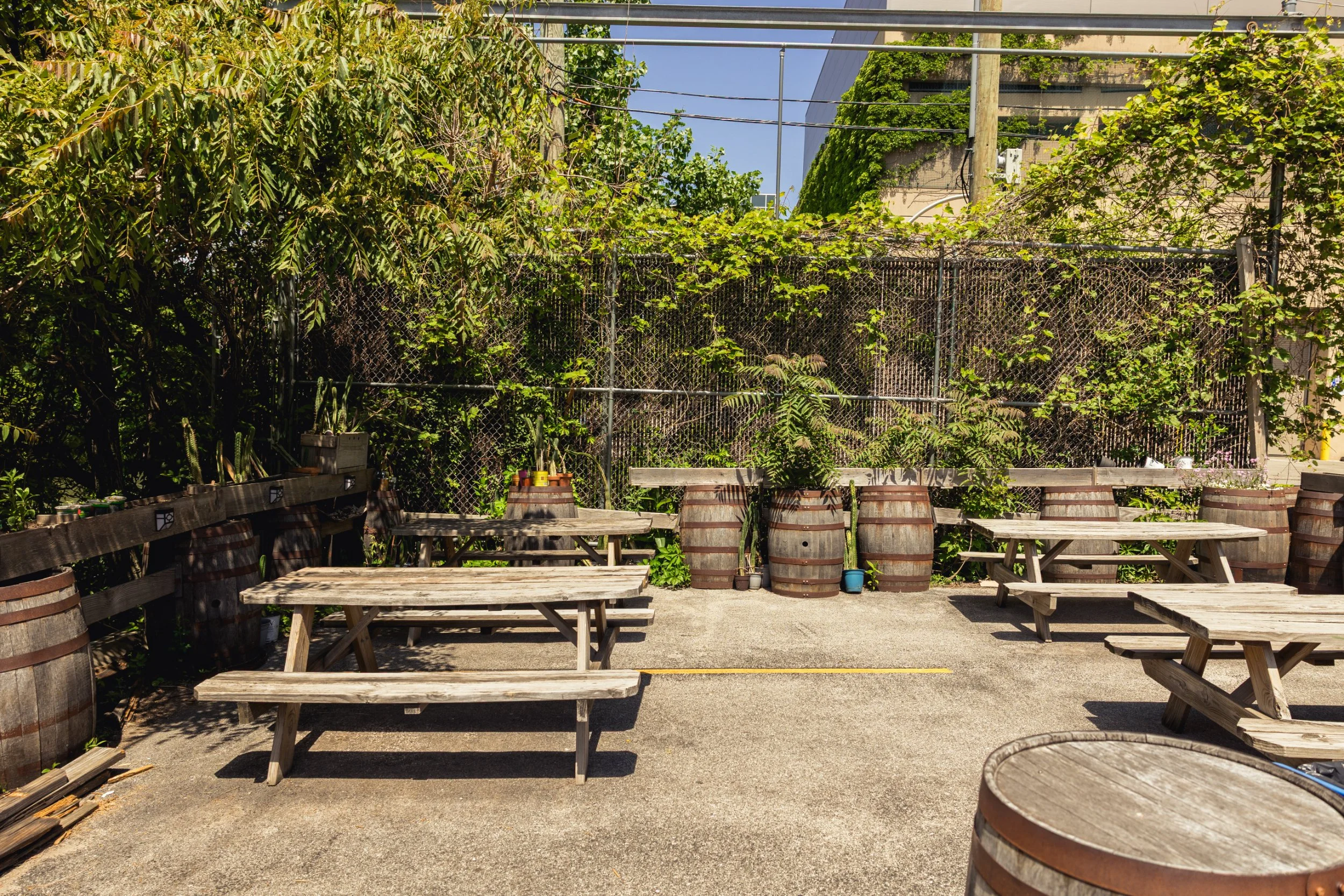
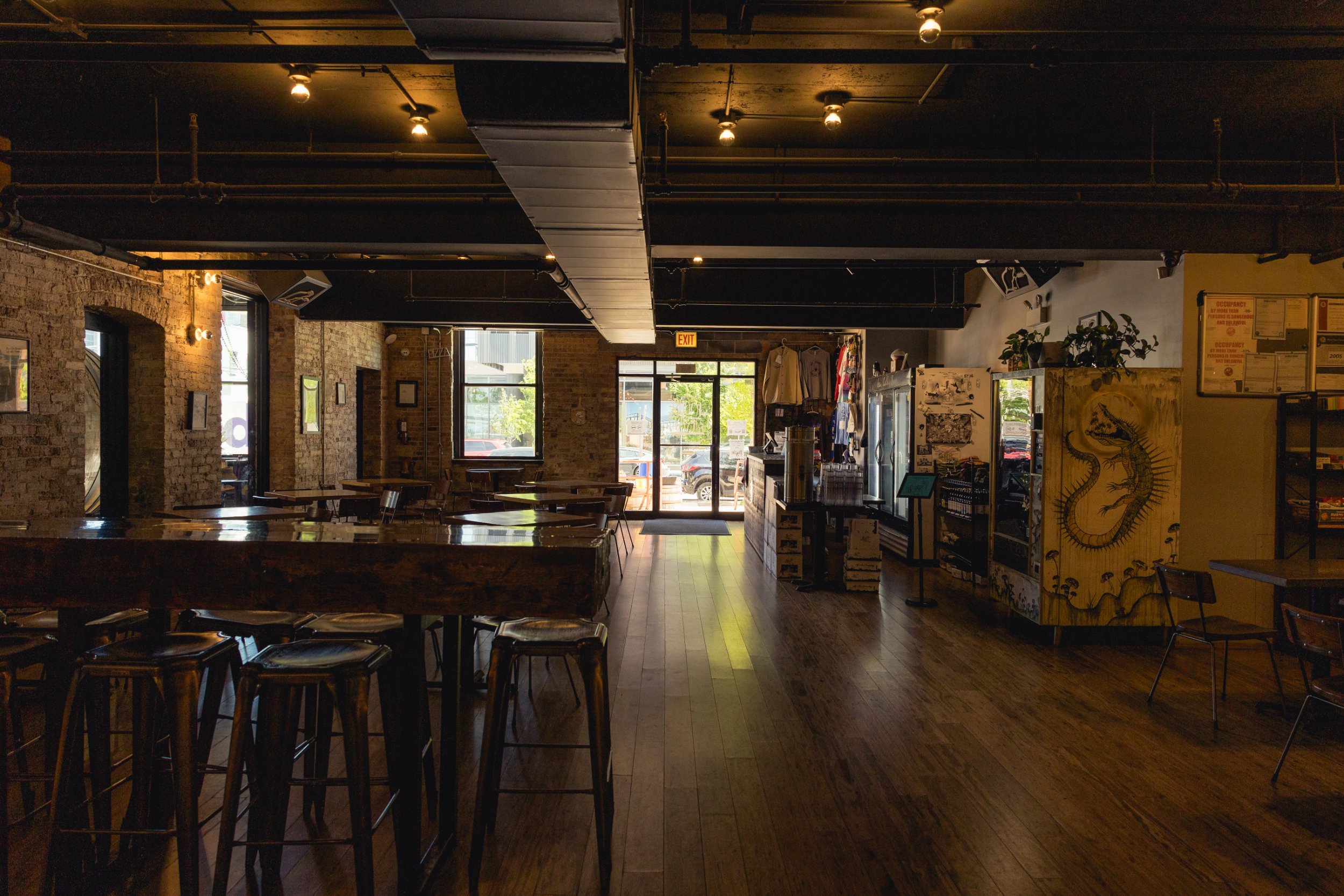
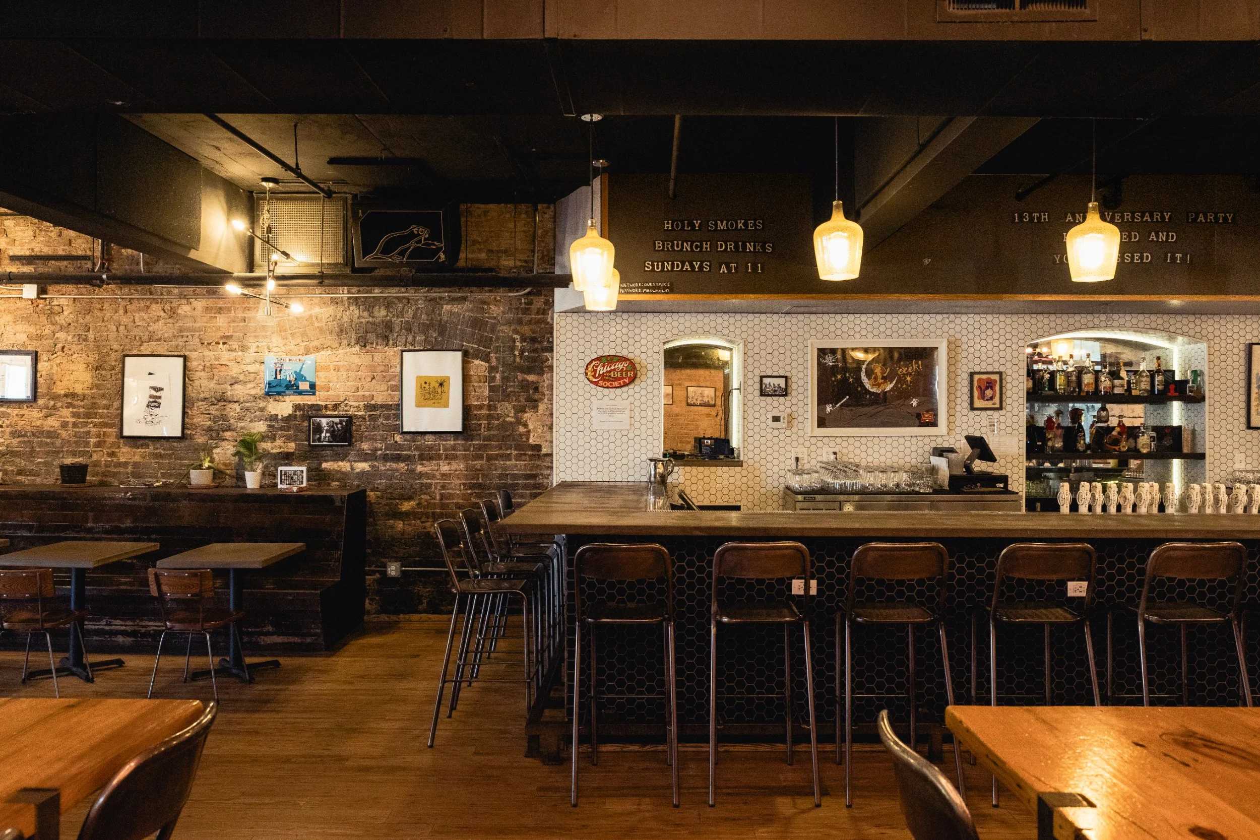
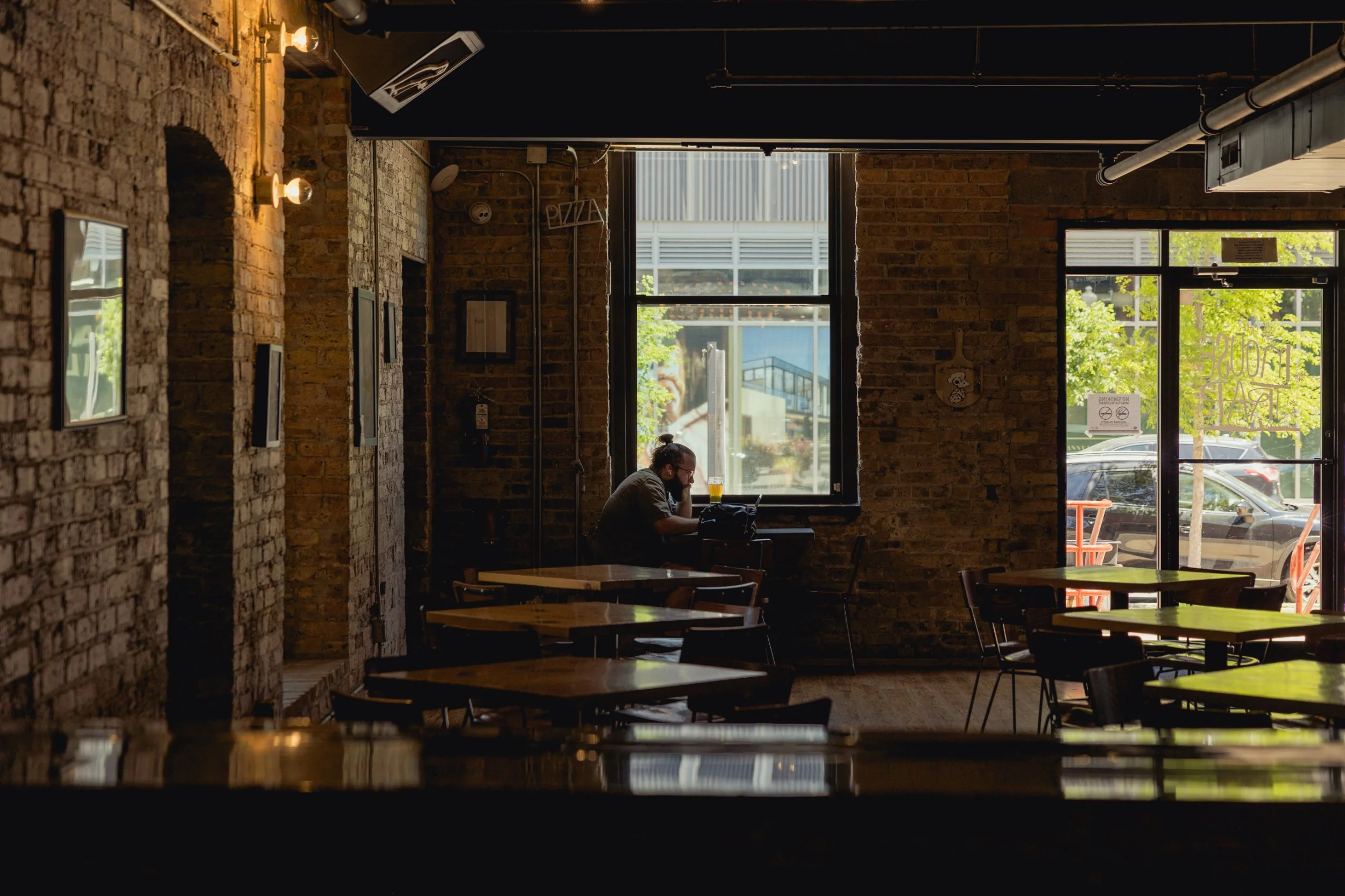
As you might expect by now, Off Color’s taproom culture is also a bit different from that of other breweries, but its team is not trying to reinvent anything. Instead, they just want to find you a beer you’ll like, and provide a space where you can enjoy yourself however you wish. There are no televisions, but you also won’t be forced to make 10 new friends if you’re just wanting to have a beer in peace.
“I feel like sometimes community means forced community,” Ben says. “Whereas sometimes communities can come together a little more organically. You always have to remember not everyone wants to be in a forced social situation. You have to make space for everyone and have times where it is just quiet.”
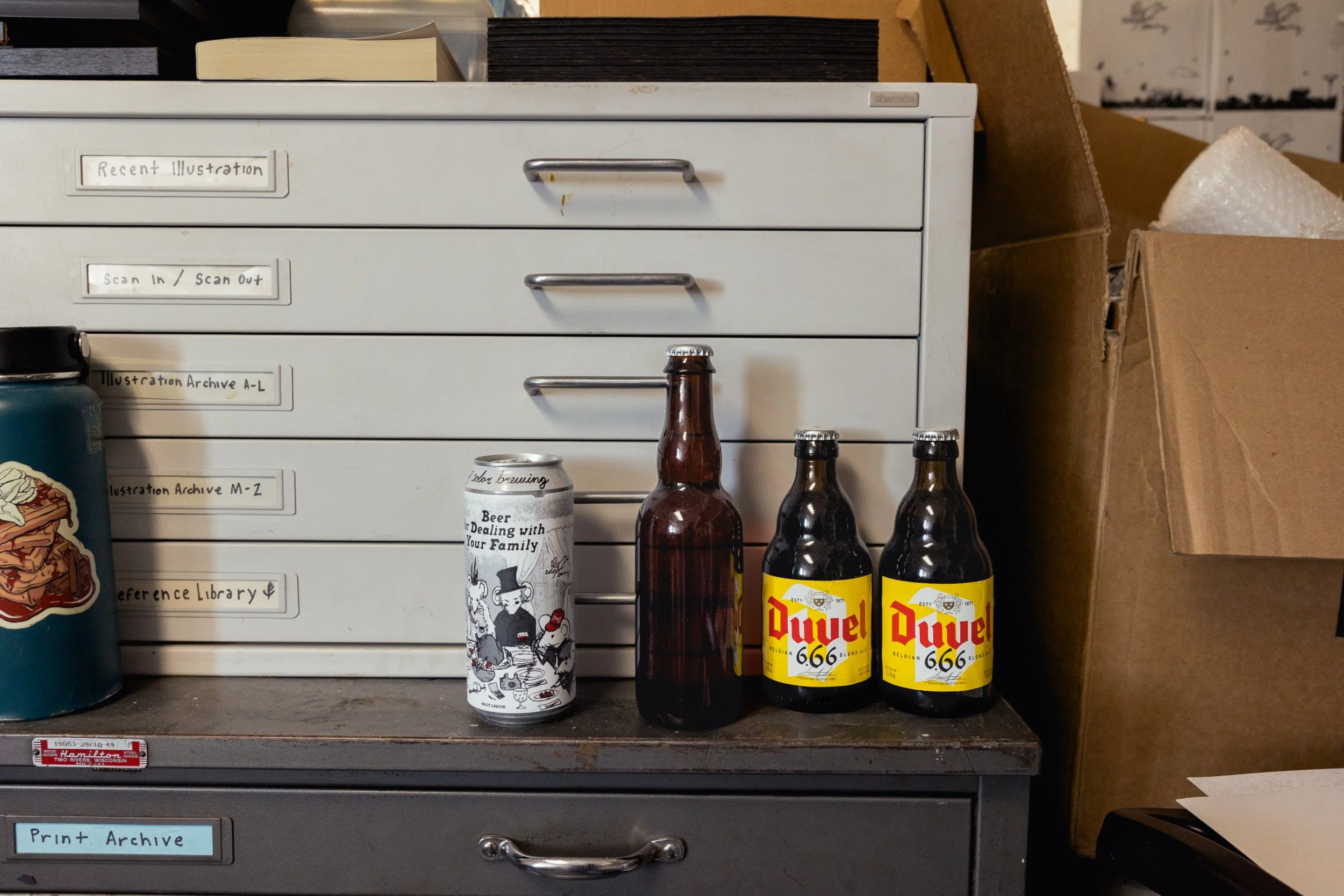
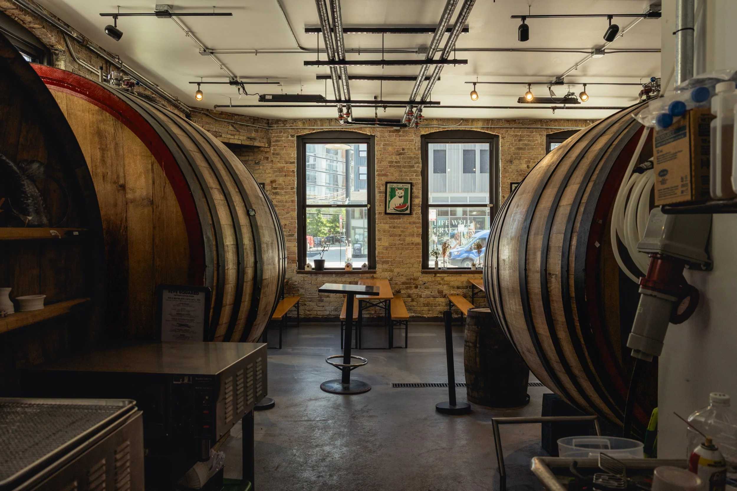
The Mousetrap—Off Color’s taproom in Chicago’s Lincoln Park neighborhood—nonetheless programs a range of creative events as well. It hosts a monthly book club that averages about 30 attendees, and Nikki has led events teaching visitors how to draw the brewery’s various mascots. For a Dungeons & Dragons group that used to meet at the Mousetrap, the host themed the campaigns around Off Color’s beers.
The welcoming atmosphere begins with the beers themselves. While the staff would love to nudge newcomers toward unexpected styles, they don’t want to tell people what to enjoy. In a sign of the brewery’s desire to meet people where they’re at, it even brews a hazy pale ale now, called Juicy Beer for Burgers (though IPA is still not in the cards).
“We got tired of people coming into the bar and asking for an IPA [and not having one], because here’s someone who knows what they want, but we had to talk them into something else,” Dave says.
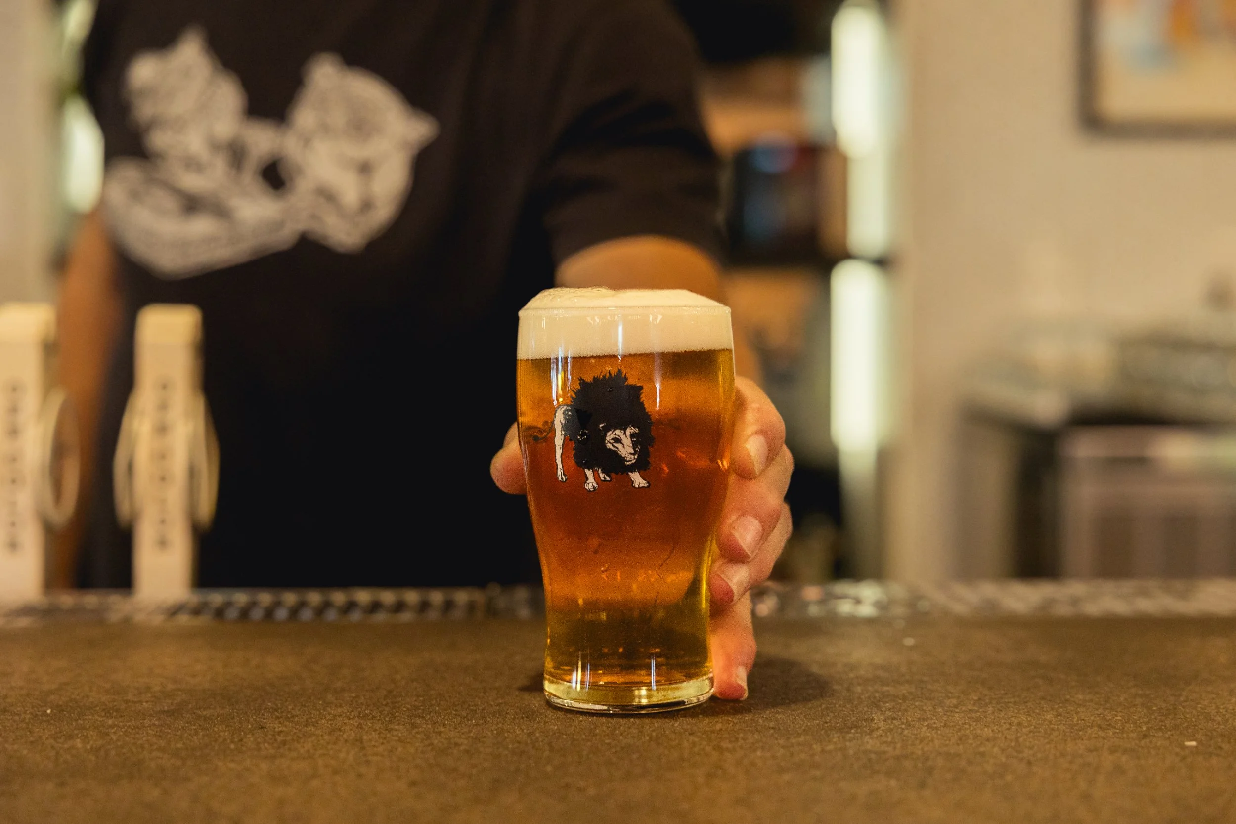
The brewery knows some of its beers are unusual, and their names aren’t exactly flavour-descriptive. In light of this, perhaps the best praise for the Mousetrap’s service culture comes from Betsy Tomszak, a local schoolteacher who leads the Off Color bookclub: “You don’t feel like an idiot when you’re ordering something here.”



Off Color infuses thoughtfulness into every facet of its operations, from recipe development to branding to hospitality. This approach has allowed it to thrive in much the same way that its mischievous little mascot flourishes: by carving out a living in the corners, the small passages, the overlooked nooks and crannies of the beer scene. The brewery is persistent rather than pretentious.
“If you’re looking at brewing as an art form, it needs to be expressing something,” reflects John. “It needs to be trying to create emotion or an idea or a thought in another human being through a very abstract function, which sometimes we hit. Sometimes we just make a Pilsner because we like to make Pilsner, but what we try to do is maintain the space to have the more artistic and emotional elements present.”